Abstract
‘Forensic metascience’ involves using digital tools, statistical observations or human faculties to assess the consistency of empirical features within scientific statements. Usually, those statements are contained within formal scientific papers.
A forensic metascientific analysis of a paper is the presentation of one or more observations made about features within that paper. These can be numerical, visual, or textual / semantic features.
Forensic metascientific analysis is designed to modify trust by evaluating research consistency. It is not designed to ‘find fraud’. While this may happen, it is not the sole focus of forensic metascience as a research area and practice, it is simply the loudest consequence.
Inconsistencies may be intentional or deliberate, deceptions or honest mistakes, but regardless they change the trustworthiness of a scientific claim. If, say, a key reference underlying a grant application lacks trustworthiness, it does not matter why this happened, it only matters that this reference is not relied on in isolation for further work.
Of course, the opposite is also true. When analysis determines elements within a paper are perfectly internally consistent, this should increase trustworthiness as well. This often happens during the analysis of well-reported, well-curated documents. Typically, these findings are much more interesting to private parties (universities, investors, funders) and less interesting to the scientific public.
A good forensic metascientist has learned the mechanics of the investigatory techniques outlined below — but this is not so challenging, as these are generally quite simple. More importantly, they have learned when each of them can be responsibly deployed to evaluate a paper. This requires more scientific literacy and good judgment than data analytic competency, programming skill, or innate talent.
With practice, a normative graduate student can become a capable forensic meta-analyst, and an experienced peer reviewer or statistician can become an excellent forensic meta-analyst. However, the best analysts are stubborn, curious, and detail-oriented, regardless of their background or experience.
The following is a guide to learning many of the available techniques in forensic metascience that have a stated quantitative approach in the tradition of Knuth’s literate programming. All code is given in R.
This is designed to be a living document, and as new techniques are developed and validated, they will be added in future defined and dated editions. A minimal level of statistical knowledge is assumed, approximately an intermediate college level of applied statistics course. Sections that do not have accompanying code are assumed trivial, but could be added on request. Previous versions and rollbacks will be available as editions proceed. Please flag any potential inclusions, errors, code modifications, etc. to james(dot)heathers(at)protonmail(dot)com.
One planned future addition is testing and background material which will more readily allow all of the following to be used in teaching courses.
This project was primarily completed from September through December 2024 thanks to the generous support of the Bill and Melinda Gates Foundation.
Citation:
Heathers, J. (2025) An Introduction to Forensic Metascience. www
Why We Analyze Papers
Forensic metascientific analysis is specialized, time-consuming, and — if paid for — expensive. It is sufficiently inaccessible that only a select few papers are ever analyzed.
Having established the general aim of analysis (to modify the trustworthiness of scientific work through the pursuit of consistency), there are several reasons a paper may be subjected to analysis:
- A key citation. In the preparation of a grant or paper, there may be results cited which are crucial to establishing a rationale. It is important that such papers contain no provable inaccuracies. In the absence of re-analyzable data, code, or other study materials (which are typically either not available or slow to access), forensic analysis can be useful.
- A flag noticed in casual reading. In general scientific reading, an incongruent or problematic feature might be noticed (see ‘Flags’ below). Sometimes these can be quite obvious. If present, a ‘flag’ dramatically increases the likelihood an analyst will find additional problems. A flag can be anything: for instance, if the mean is reported as two different values across the whole paper; if a statistical test is clearly wrong, or out of range (i.e. F=200, d=4.5, or similar); if there is noticeable a mismatch between test statistics and p-values, etc. The list of flags is quite long, and some are outlined below.
- A diligence process. A university, venture capital firm, funding body, grant committee, or other interested party may require documents to be analyzed for accuracy. The reasons for wanting this are obvious — most commonly, the documents might affect an funding, investment, or hiring decision.
- A ‘report’. Forensic metascientists often act in a consultant role to domain experts, and a ‘report’ is simply a flag that is noticed by someone else and passed to an analyst. These are often more sophisticated than regular flags, as they are features being noticed as incongruent by someone with specialized knowledge. An analyst can often take such a report and work responsibly in unfamiliar scientific areas. Reports are a common reason that a forensic meta-analysis is conducted.
- A research interest. Data within a paper may be wanted for meta-analysis, mega-analysis, or other form of re-analysis. Some forensic techniques provide reconstructed data which can be used to test different hypotheses, or provide Monte Carlo estimates, or provide comparison points for other datasets, etc.
- Author history. In the interests of pursuing general scientific accuracy, analysts often work on papers of authors who have already shown themselves to have published inaccuracies elsewhere.
- Just because. Science is supposed to involve in-depth scrutiny, and scientists are supposed to be curious. Analysts often become interested in ‘the details behind the details’ in their own right.
- To extend forensic metascientific techniques. Sometimes to investigate a certain test or data feature, the only requirement for analysis is that a paper use that test or feature.
Flags
What is a flag?
Forensic metascience techniques are most commonly deployed on a document which becomes a target paper after a flag is identified — generally, flags are the typical starting point of an analysis. As above, a flag is simply any visible incongruity:
- A data feature that seems statistically unlikely or unusual (for instance, an effect size of d=4 in a treatment effect you would expect to be less substantial)
- A data feature that is missing (for instance, a whole-sample n is given, but no cell sizes)
- A data feature that seems odd in the context of a field (for instance, an anemia rate in a wealthy country that is over 40%)
- An unusual method for the presentation of data (for instance, using median [IQR] and ordinal analysis for data that is always described in other equivalent papers as normally distributed)
- A paper with strange forensic scientometric features, or unusual language (for instance, a paper that has a block of 12 citations to the same author group inserted at random, or the text including an AI prompt that says ‘Generate response’!)
- Even spelling or referencing mistakes, if they are in a crucial portion of the paper which you would expect to be heavily scrutinized
- Any other unusual, repeated observation — after spending some time in any individual research area and uncovering some incongruities, you will be able to generate categories of your own.
Flags can come from anywhere. Specifically:
- An analyst may regard a journal, author, or combination of authors as suspicious (for instance, when the paper is authored by a group who have several Pubpeer.com entries), and be reading on that basis
- An analyst may notice a flag during general reading
- An analyst may uncover a flag after initial analysis
- An analyst may receive a paper from a domain expert, someone who understands the field very well and is more capable of noticing incongruities (as above, these are ‘reports’, and are just flags from someone who knows more than you do)
- An analyst may discover a flag elsewhere (for instance, a suspicious clinical trial registration) which leads back to a paper published on the data it described
Having discovered a flag, this leads to triage.
Flags and their place in triage
A forensic meta-analyst has two jobs:
(1) assess the details presented within a target paper to investigate its trustworthiness, as above; but also
(2) protect their time
Triage is extremely important, because triage protects time.
Choosing what to work on is just as important as learning how to deploy the analysis methods.
Like analysis itself, triage is a skill that develops with intuition and experience.
A practically infinite number of papers exist, and a practically infinite number of potential analyses can be deployed on them, and within these endless opportunities, we have a task where it is easy to become hyper-focused, curious, or to switch from a chosen analysis path in order to establish a new observation.
Combined, these two factors are fatal to the timely completion of analysis.
As a consequence, an informal system of managing analysis has evolved. The one outlined here is not the only one possible! Whether the following is executed precisely to the letter is less important than (a) that you use a formal triage system if conducting the work in a professional capacity, and (b) that you follow it, while continuing to develop it.
A potential triage system has four stages:
(1) Reading
Reading leads to flags (see above), and flags lead to…
(2) Initial analysis
Initial analysis is the first step of using the techniques outlined in this document to analyze parts of the target paper. In general, it is not required to keep notes, nor make a record of analysis pathways. Analysis can be haphazard or systematic, depending on the circumstances (maybe only a few things are very slightly suspicious, for instance). If initial analysis reveals one or more problems that warrant further investigation, it leads to…
(3) Formal analysis
Formal analysis takes longer because it involves the presentation of all elements within a target paper in a separate document. All in this case really does mean all — trustworthy or not, analyzable or not, every analysis should be included alongside any code, technique, etc. with findings. This is often the end of an investigation — formal analysis on a single paper, for instance, would be what a journal editor suspicious of a result in their journal would expect. But if formal analysis is in service of a broader goal, it leads to…
(4) Scouring
Scouring is the meticulous coverage of all relevant elements beyond simply a paper, including but not limited to two or more papers, a whole journal issue, a whole grant application or proposal, a whole career. Essentially it is a series of formal analyses with a theme. Scouring can take a long time. It is usually boring and — if it is being funded — expensive. You would need an exceptionally strong reason to scour the entire publication record of a single prolific researcher. Scouring an author’s entire corpus of work can take years, and thousands of hours of analysis time. This requires, more than anything else, incredible patience and steadfastness. As a consequence, it is also reasonably uncommon.
In short: it is usually best practice to decide in advance how much work you will do on any given paper, or for any given task, or for any given contract. You will never have the time to throw the analytical kitchen sink at every paper in front of you.
An Introduction to Techniques
Having found a flag, or perhaps requiring that a single chosen document be checked for accuracy without one, an analyst proceeds to deploying the available data analytic techniques on a paper.
Unfortunately, many papers actively resist this. For instance:
- It is very hard to analyze a systematic review beyond the time-honored technique of ‘reading all the cited papers, and making a determination of whether or not they are accurately represented’.
- Likewise, opinion pieces, viewpoints, qualitative research, etc. — these all lack the necessary features to analyze.
- Commonly, some more technical fields may present data too complicated or esoteric to analyze.
- More commonly still, papers that are poorly reported do not support analysis very well, because there is very little information available — writing a poor quality paper is actually a viable defense against that paper being checked!
- Some data types are present summary statistics that make for tricky inferences. For instance, survey items that are made up of many subscales with unusual or non-standard combinations of items.
That being said, many of them do allow this. For those, we have this guide.
For the tests that I have personally contributed to, I maintain a website with information and resources about all the tests you can access here. Future editions of this document may include dramatically expanded external resources.
Principles to keep in mind
- It’s OK to get help. Many analysts do not work alone, but in small teams (2 or 3 would be normal). The workflow in this environment usually consists of: (1) working individually on separate observations, and then presenting them to others for checking; or (2) working collaboratively on the same codebase, document, analysis body, etc. simultaneously; or (3) recreating the same analysis of the same document while mutually blinded. Teamwork is the first and best protection against raising unfounded points of inconsistency, and the fact you have to immediately convince another skeptic will dramatically affect your confidence. This is a good thing — it is supposed to do that. It is generally a bad idea to work by yourself and then release analysis publicly, until you are experienced. Unfounded observations are unfair to authors, personally and legally dangerous to the analyst, may waste journal and/or university time, and reduce the trustworthiness of forensic metascience as a whole.
- It’s OK to be frustrated. Out of a basket of randomly chosen papers, how many of them can be analyzed? There is no good estimate at present, but a bad estimate would be: about half. If you wish to analyze a paper but conclude ‘there is nothing I can responsibly analyze here’, it is understandable to be disappointed or frustrated sometimes. Likewise, if an analyst would like to see the raw data behind a paper to confirm it, it will usually not be available. Likewise, if an analyst takes findings to an academic journal, government body, or university, there may be a complete lack of interest shown in what you’ve found. This is simply part of the work. It is inevitable and unavoidable. All you can do is make your case, and move on.
- Indeterminate answers are common. Often you analyze a table or a series of numbers, and you don’t have a concrete answer to the question: “Is this data inaccurate?” The data may be impossible, incredibly unlikely but technically possible, or merely just somewhat strange — and you may not be able to determine which of those options it is. Again, this is part of the experience. And, having found an inaccuracy, you may be entirely unable to determine what caused it.
- Forensic metascience can scare people. Most researchers or other research-affiliated people have not heard of what you are about to learn to do. Many people find the experience of being presented with a forensic meta-analysis rude, frightening, or confusing, especially if they are not statistically minded. So, present data and findings straightforwardly, and with the maximum amount of explanation necessary. Resist the temptation to write angry emails in all-caps. Do not copy a dozen uninterested third parties into those emails. If you act like a crank, you will be treated as one.
Data Techniques
Simple numerical errors
Given that scientific papers can have hundreds or thousands of individual details typed into a narrative structure, numerical errors are understandable.
However, given scientists have access to free, robust, controllable data environments, numerical errors can also be suspicious and dramatically reduce trustworthiness — especially if those errors are favorable to the hypotheses of interest, repeatedly expressed, or accompanied by other incongruities.
The below are some examples of canonical errors which do not need accompanying code or longer explanations.
Summation
Khadilkar et al. (2024) conducted an RCT supplementing diabetic and underprivileged children with vitamin-D. In the introduction, the paper states:
“Methods: 5 to 23 year old (n = 203) underprivileged children and youth with T1DM were allocated to one of three groups”
Then, later, you see:
“A total of 203 participants were enrolled in the study, including 99 boys (48.8 %) and 104 girls (52.2 %).”
48.8% plus 52.2% is 101%. As the cell sizes are provided, we can immediately ascertain that the figure for girls should be 51.2% (104/203).
This is most likely a simple typo, but it is also a flag. (The paper has 14 authors. Did no-one notice?)
Flags like this are commonly noticed during general reading or during initial analysis (that is, after other flags have made you more interested in a paper). Intuition for this elementary arithmetic develops quickly.
Consistency
Just as easy as the above (but sometimes more of a problem for the authors!) are numerical consistency errors. For instance, Alalfy et al. (2019) investigated the effect of different perioperative wound closure techniques, and reported:
“The age of patients included in this research was between 25 and 35 years, with BMI > 30 (so, we do not have a group of women with BMI below 30 as our focus in the present research was to assess the obese women)... The following patients were excluded women with BMI < 30”
However, the same sample is later described in Table 2:
BMI: range 23.0–45.0, mean=34.5 ± 3.6, median=34.0
These cannot both be true simultaneously. This represents an elementary mistake, but quite a bad one. The three options are, as they often are:
- The first detail is wrong
- The second detail is wrong
- Both are wrong
In this case, it is likely to be both: the rest of the paper is saturated with a variety of other errors. If you would like to read a full analysis of that paper, it can be found here.
Sample and cell size mysteries
During analysis, it is good practice to highlight or separately write down figures like the above, so they can be compared later.
While this is simple in theory, it can involve a lot of individual details. For example, here are the analysis notes I took for Ballot et. al. (1989) “Fortification of curry powder with NaFe(111)EDTA in an iron-deficient population: report of a controlled iron-fortification”.
(This was from the Initial Analysis phase, after the publication was flagged because the paper never reported the initial cell sizes. My later notes are in brackets with JH appended.)
264 families comprising 984 individuals
Children aged < 10 y were excluded
Forty-five individuals with a hemoglobin (Hb) of 90 g/L were … excluded from the study.

(JH: ie. n=939)

Power calculation: “This gives a sample size of 142 in each group and sex with a total sample size of 568.”
(JH: groups are fortified/not fortified and men/women. Study oversampled to meet power threshold.)

The 264 families were divided by use of computer-generated random numbers into
fortified (135 families) and
control (129 families) groups

After 2 y of fortification, 672 subjects remained in the study.
A total of 267 subjects dropped out of the study:
129 moved away from the area,
115 refused to participate further,
and 23 died.

(JH: 672+267 = 939, OK)
(JH: 129+117+23 = 267, OK)

No significant differences in the number or category of dropouts between the fortified and unfortified.

Table 2 n's: 161+164+139+134 = 598 (JH: ?)
Table 3 n's: 127+139+124+115 = 505 (JH: ?)

Table 4 (female fortified, above n=139):

Adding up the various subgroups
70+29+15+32 = 146 (+7)
126+29 = 155 (+16)
51+49+53 = 153 (+14)
53+65+34 = 152 (+13)

What's going on??
As per the final plaintive line above: there are plenty of incongruities here.
Totals and subtotals, which give way to group/cell totals and subtotals, are often poorly reported because authors often do not think including how much data was lost, excluded, or conveniently forgotten at every level is something anyone else will care about. Analysts do, of course, and the inability to correctly report cell and sample sizes may change our opinion of the author/s.
There are two primary frustrations with errors of addition such as these: (1) when you stack a few of them together, poorly reporting a portion of a portion of a sample and not recording data exclusions at any point, it is often impossible to reconstruct the relevant cell sizes, and (2) it’s typical that we don’t get to know why this data reporting is so haphazard, because authors rarely return requests for data or clarification. In a paper such as this, published in 1989, we’ll never see that data for another more simple reason — it is lost. All we get to know is: there are many un-reported exclusions, and a lot of data missing in a way that is haphazard and unpredictable.
A series of details like this should be classified as concerning rather than fatal to the hypotheses of interest. Older papers were often published when there were different data reporting standards! But having found these features in an initial analysis, we’d typically analyze the paper further — and that’s exactly what we’ll do here, further down in ‘GRIM: Reconstructing means’.
Confusing SD and SE
This specific error in data reporting is so common it gets its own category. There is a long and unfortunate history of researchers confusing these two related metrics.
The standard error of the sample mean depends on both the standard deviation and the sample size, by the simple relation SE = SD/√(sample size). The standard error falls as the sample size increases, as the extent of chance variation is reduced—this idea underlies the sample size calculation for a controlled trial, for example. By contrast the standard deviation will not tend to change as we increase the size of our sample. Altman and Bland (2005)
This simple statistical note outlines everything you need to know about the error, and the below illustrates how (alarmingly!) common the error can be.
Thirty-five (40%) of the 88 studies that reported means along with a measure of variability reported the standard error of the mean instead of the standard deviation. The standard error describes the precision with which the sample mean estimates the true population mean but does not provide direct information about the variability in the sample. Because the interpretation of the standard error is different from that of the standard deviation, it is critical to indicate which summary is reported. Olsen (2002)
If you are re-creating statistical tests (see the below sections), and it feels like nothing works, check to see if the authors have confused SD and SE. Bear in mind the statistics could be correct but the reporting of the values incorrect, or vice versa, or some combination.
Here is a straightforward example:
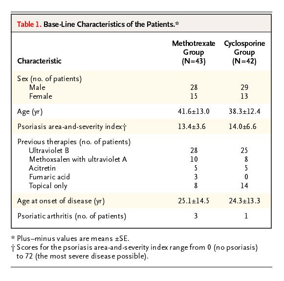
This paper compares two treatment regimes for psoriasis. How should we make the determination that SE is written but the authors actually meant SD? One way is to reconstruct the data (see SPRITE, below) and sanity-check it. You can also calculate a statistical test (a between subjects t-test would be fine, for instance) and determine if the output is plausible.
But, more straightforward than either of those: simply convert the values (SD to SEM, or vice versa) and see if the conversion is viable.
## the sample sizes
n1 <- 43
n2 <- 42

## the supposed SEs
listed_SE1 <- 13
listed_SE2 <-12.4

## calculate the implied SDs
SD1 <- sqrt(n1)*listed_SE1
SD2 <- sqrt(n2)*listed_SE2

SD1
SD2

## OUTPUT
> SD1
[1] 85.2467
> SD2
[1] 80.36118
No sample of ages in human history has ever had an SD of 80 or 85! Ages cannot vary that much, even with an incredibly strange sample of newborns and centenarians.
This method requires you to use reasoning, but very little. This might become more challenging if the result published is obscure (reasoning around ‘the potential ages of participants in a study’ is easy to determine, ‘the expected lifespan of genetically diabetic-obese (db/db) mice with a leptin gene mutation’ requires a bit more knowledge.)
But even if some local knowledge is required, you can usually just re-calculate the potential alternative value and determine something is amiss. The same applies to confusing SE for SD (i.e. the reverse of the above).
While this is a simple error — simple to make, simple to find, simple to fix — whole papers have previously been shown to be completely meaningless due to this oversight. Happily for the authors, (a) this is usually an honest mistake of statistical ignorance, not anything that implies a problem with research integrity, and (b) this means the paper can be corrected or re-published with the right values in place.
From the perspective of the analyst, this obviously means the relevant results in the paper are not trustworthy. However, there is the strong likelihood that you can calculate the correct results without consulting the authors.
The ’quick’ SD check
Of all the heuristics an analysts develops when looking for flags in a hurry, one of the most useful (and the most certain) concerns standard deviations presented in text.
Let’s say we only know the min (10) and max (20) of a sample (n=20). What’s the maximum variance that sample can have?
The answer is: the points of maximum variance for any given mean are defined by all the samples made up out of [10,10,10,…20,20,20]. Consequently, the means vary from just above 10 (all 10s except one 20) and just below 20 (all 20s except one 10). The maximum variance is found at a sample of 10 10s and 10 20s. This has a mean of 15, and a sample variance of 26.316, and (not shown below, but very important) a sample standard deviation of 5.130. That’s just over half the range.
library(ggplot2)

n <- 20
combinations <- expand.grid(rep(list(c(10, 20)), n))
means <- rowMeans(combinations)
variances <- apply(combinations, 1, var)

data <- data.frame(means, variances)

ggplot(data, aes(x = means, y = variances)) +
  geom_point() +
  labs(title = "Means vs Variances of Combinations", x = "Means", y = "Variances") +
  theme_minimal()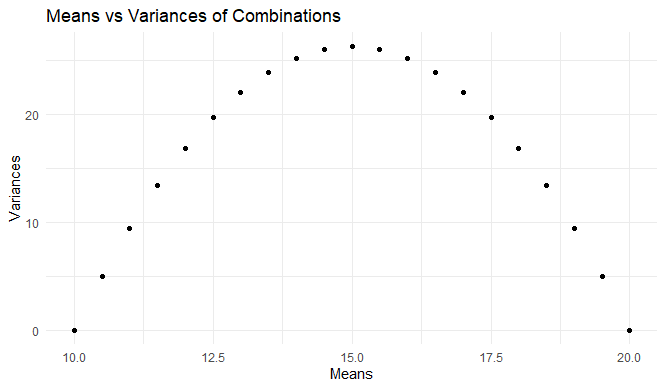
(For those of you interested in taking this further, the relationship outlined here has been formally defined. A familiarity with the underlying mathematics is necessary to develop and extend these techniques.)
What it amounts to in this context is:
- the standard deviation of any sample has a maximum value of just over half the range
- just over half becomes closer and closer to exactly half when n increases
Keep this in mind, and you can spot unusually high SDs at a glance. Here’s an example of Alexander Magazinov using this rule on PubPeer to spot some unusually high SDs in age data. (You can see the derivation in brief at the top of his post, if you’re interested.)
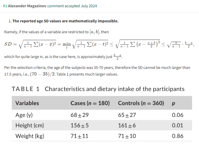
This is a very useful observation, because it’s fast and easy to evaluate at a glance. There are very few forensic metascientific techniques which are this efficient!
For a formal written analysis of data like this, we generally use SPRITE — which we’ll meet later — as it will return other relevant information, like the maximum possible values and the distribution needed to obtain those values.
Recalculation
Many reported statistical tests can be recalculated from the test statistics they present. Usually, this is quite straightforward, and this simplicity means that recalculation is usually a forensic meta-analyst’s first port of call for investigating any given paper.
Independent-sample t-tests
Take this table from Afsharpour et al. (2019), for instance:
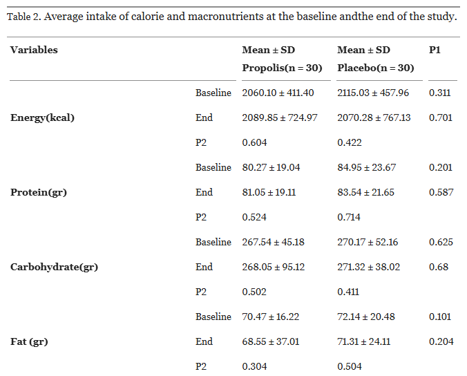
Each row is an independent samples t-test, each column is a within-samples t-test.
We’ll get to the within-sample t-test in a later section, but for now, let’s recalculate the simpler independent samples test. If we take just the first line of this table (ending p=0.311), and open a quick online calculator, we can reconstruct the test…
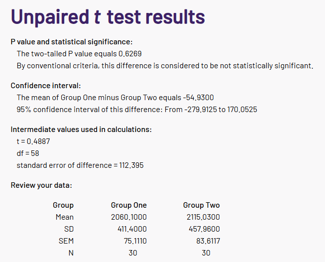
… or not.
The paper’s p-value is not 0.6269, it is 0.311. Something is clearly amiss.
This simple recalculation does not require that you already know the t-statistic (although it will usually be reported, and is handy to sanity check proceedings!), because the t-value is simply the difference in the means, divided by the standard error of the difference, and these are calculated from the group descriptive statistics and the cell sizes. However, if the t statistic is reported, you can also check that too (and a similar calculator will do, in a pinch).
To calculate it in R is pleasingly straightforward:
# get library
library(stats)

# define groups
mean1 <- 2060.1
sd1 <- 411.4
n1 <- 30

mean2 <- 2115.03
sd2 <- 457.96
n2 <- 30

# calculate the t-statistic...
t_stat <- (mean1 - mean2) / sqrt((sd1^2 / n1) + (sd2^2 / n2))

# and the df...
df <- n1 + n2 - 2

# and thus the p-value (2 sided)
p_value <- 2 * pt(-abs(t_stat), df)

# Output the p-value
p_value
This returns the same p-value as our online calculator, just with more decimal places (and the difference between p=0.6268801 and p=0.6269 will become important later!) It also confirms our suspicion that something is amiss with the calculations in this paper.
NOTE: when back-calculating t-tests in greater detail, always remember that a paper may use either Student’s t-test or Welch’s t-test (here’s a discussion about the difference), and then fail to mention which was used. Also, there will often be no discussion about the assumptions of variance — so no clues, either. When in doubt, remember to test both scenarios.
Within-subjects t-tests
Above, we saw how easy it was to recalculate an independent samples t-test. Although underappreciated, it is also possible to check elements that are hidden in a within-sample t-test, and it is only slightly more complicated than the between-subjects version.
Happily for us, meta-analysts — the regular kind, not the forensic kind — are very interested in rmSMDs (repeated measures standardized mean differences) for assessing multiple measurements across different papers. In deriving those, they have established some simple statistical procedures we can borrow for forensic analysis. Jané and colleagues (2024) have an excellent expurgation of how this is possible in a range of scenarios, which is worth reading in full if you are dealing with a lot of within-subjects data. You can see the elements described below here directly reflected in their preprint.
Let’s start with a fully worked example. Say we have n=10 within-subjects observations, which represent how well some study participants are recovering from an injury. In this case, let’s say we a measuring some blood metabolite pre- and post-physical therapy, such that:
Time 1 | Time 2 |
|---|---|
10 11 12 13 14 15 16 17 18 19 | 6 15 14 11 9 7 11 18 20 22 |
From this, we can calculate:
- the column means and SDs
- the correlation over time (r=0.662),
- the change scores and their mean, then
- the (change scores - mean change), then finally
- the squared deviation
Table 2:Laying out the within-subjects t-test calculations
Time 1 | Time 2 | Change Scores | (Change - Mean Change) | Squared deviation |
|---|---|---|---|---|
10 11 12 13 14 15 16 17 18 19 M=14.5 SD=3.03 | 6 15 14 11 9 7 11 18 20 22 M=13.3 SD=5.46 | -4 4 2 -2 -5 -8 -5 1 2 3 MEAN = -1.2 | -2.8 5.2 3.2 -0.8 -3.8 -6.8 -3.8 2.2 3.2 4.2 | 7.84 27.04 10.24 0.64 14.44 46.24 14.44 4.84 10.24 17.64 Squared deviation = 153.6 |
So the sample standard deviation is the square root of the squared deviation divided by the degrees of freedom (sqrt(153.6/9) = 4.13…) and, finally, we can calculate the denominator of the t-test, 4.13…/sqrt(10) which is 1.31.
Hence, the t-statistic is -1.2/1.31, which is t=0.92, p=0.382.
But: let’s say we have none of this, and all we have is a far more typical and rather terse description of an experimental outcome:
After 8 weeks of physical therapy, n=10 participants showed no significant difference in their levels of blood metabolites (mean_pre=14.5 (3.03) vs. mean_post=13.3 (5.46), p=0.382).
That doesn’t seem like much, but we can use it to recreate most of the above.
- The mean of all the differences is the same as the difference in all the means, so mean_diff=-1.2
library(stats)

  mean_pre <- 14.5
  sd_pre <- 3.03
  mean_post <- 13.3
  sd_post <- 5.46
  n <- 10
  p <- 0.382

  mean_diff= mean_post-mean_pre

# OUTPUT
>   mean_diff
[1] -1.2- The p-value allows us to retrieve the t-statistic
# get paired t from p value
paired_t <- qt(p/2, n-1, lower.tail = FALSE)

# OUTPUT
> paired_t
[1] 0.919132- We can retrieve the correlation between the datasets using the newly-calculated t-statistic…
  r <- (paired_t^2*(sd_pre^2 + sd_post^2)-n*(mean_post-mean_pre)^2) /
    (2*paired_t^2*sd_pre*sd_post)

#OUTPUT
> r
[1] 0.6633034- Then, we can use the correlation and our newly uncovered r value to calculate the sample standard deviation provided above…
sd_change <- sqrt((sd_pre^2 + sd_post^2 - (2*sd_pre*sd_post)*r))

#OUTPUT
> sd_change
[1] 4.131181- … or we could find the same figure (divided by sqrt(10) in this case) by just using the mean difference and the t-value to calculate the t-test denominator
# get t-test denominator from t statistic and mean difference
t_denom <- mean_diff/paired_t

#OUTPUT
> t_denom
[1] -1.30558
Any errors or impossibility in these transforms is a big problem — there are no approximations above, only conversions of values which should be precise and straightforward. When you become familiar with the steps, within-subjects t-tests should be almost as fast to recalculate as between-subjects, and just as definitive.
Let’s return to Afsharpour et al. 2019 (as seen previously), where we have a series of within-subjects results. The first one listed is:
Propolis group, Time 1: 2060.10 (411.40), n=30
Propolis group, Time 2: 2089.85 (724.97), n=30 (i.e. no dropouts)
This gives us a p-value of 0.604. Is it correct? Let’s find out.
Again, a within-sample t-test is calculated by taking the mean of the differences (i.e. Time 2 - Time 1 for every participant), and dividing that by the sample standard deviation of the differences, adjusted for the sample size.
We have neither of those figures to begin with, so both need to be retrieved using the code above.
In this case, we can proceed straight to trying to retrieve the correlation between the Time 2 and Time 1 values.
# Retrieving the correlation from the p-value and descriptive statistics in a WS t-test
# Adapted from Jané et al. (2024)

mean_pre <- 2060.10
sd_pre <- 411.40
mean_post <- 2089.85
sd_post <- 724.97
pval <- 0.604
n <- 30

# get paired t from p value
paired_t <- qt(pval/2, n-1, lower.tail = FALSE)

r <- (paired_t^2*(sd_pre^2 + sd_post^2)-n*(mean_post-mean_pre)^2) /
    (2*paired_t^2*sd_pre*sd_post)

#OUTPUT
> r
[1] 1.002958
Unfortunately for the authors, this returns r=1.002958, which is an impossible value for a correlation coefficient and a common anomalous finding that is possible when checking within-subjects t-tests. Given the between-subjects p-value using the same data is also wrong, you might have an negative opinion of the accuracy present in the rest of the paper (and in this case, you would be correct).
Within-subjects t-tests take a little work to understand, but it is well worth it.
One-way ANOVA
One-way ANOVAs are commonly deployed in research that compares more than two groups at baseline, although they have utility elsewhere. There is an online webpage, as there often is, for testing this straight from your browser. Here’s what a sample of what that might look like.
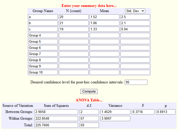
It’s a little unwieldy, so let’s reproduce this in R.
(Note: there is almost certainly a package or function somewhere which does this for you, but I have never located it, as the code below works.)
    library(stats)

    # Enter the data
    means <- c(1.52,1.86,1.33)
    SDs <- c(2.5,2.1,0.94)
    n <- c(20,21,19)

    # Get the # of means and overall mean
    k  <- length(means)
    o.mean  <- sum(n*means)/sum(n)

    # Calculate the degrees of freedom for between and within
    dfb <- k - 1
    dfw   <- sum(n) - k

    # Calculate the mean squares for between and within
    MSb <- sum(n * (means - o.mean)^2)/(k-1)
    MSw <-  sum((n-1)*SDs^2)/dfw

    # Calculate the F value
    F_value <- MSb/MSw

    # And convert that to a p-value
    p_value <- pf(F_value, dfb, dfw, lower.tail = FALSE)

# OUTPUT
> F_value
[1] 0.3716134
> p_value
[1] 0.6912792
Either method should tell you if your one-way ANOVA of interest is correctly calculated.
You can also calculate the sum of squares, effect sizes, contrasts, etc. but you’ll rarely need to.
Two-way ANOVAs etc.
N-way ANOVAs are common, but they cannot be fully reproduced from their summary statistics. You can approximate them using SPRITE, which will be discussed briefly in the section below. However, the F value to p-value conversion can be checked.
Here’s Gino and Moore (2007):

There are many online calculators that will allow you to check this calculation:
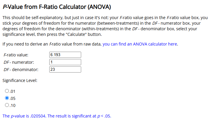
Or you can use a single line of R code, as above.
p_value <- pf(6.193, 1, 23, lower.tail = FALSE)

# OUTPUT
> p_value
[1] 0.02050397
While we’re here, an interesting point: the very next paragraph of that paper gives us a situation which means we strongly favour using R to perform these conversions where possible:

An online calculator gives us the same result (<.0001) but that does not tell us what the p value is, just what it is smaller than. R has no such problems:
p_value <- pf(28.55, 1, 60, lower.tail = FALSE)

#OUTPUT
> p_value
[1] 1.486112e-06
We will see these sorts of values again later, in the section on the STALT test.
Chi-squared
The chi-squared test is the non-parametric workhorse of determining a difference between nominal or categorical variables. It is easy to recalculate, there are several online calculators available, and the relevant R-code is trivial (see below).
There is only one complication: depending on the sample size and research area, what is often simply described by the shorthand ‘chi squared’ or not described at all is usually one of three tests:
- Pearson’s chi-squared test
- Pearson’s chi-squared test with Yates’ correction
- Fisher’s exact test (for a 2x2 comparison)
You can find recommendations for (or against) using each test elsewhere, but for our purposes here, be aware:
(a) researchers tend to think of categorical calculations as somewhat monolithic,
(b) papers can significantly under-report which test was used, and
(c) some software makes decisions about what test / correction to use without user input!
Let’s test a quick example where we might see this tension:
"In City X, a catchment of n=382 people were identified drinking from Water Source A, n=57 of which showed symptoms of infection within the three months of the study. Only n=9 citizens who drank bottled water became ill (n=126) over the same timeframe. The difference was significant (p=0.02).”
Obviously, this is a little slapdash, but it is not particularly unusual amount of brevity.
Either way, we can calculate the cell sizes, and test all three possibilities.
# Put the data in a 2x2 matrix
test_mat <- matrix(c(9,117,57,325), nrow = 2, ncol = 2)

# With Yates
chisq.test(test_mat,correct=TRUE)
# Without Yates
chisq.test(test_mat,correct=FALSE)
# Fisher's Exact Test
fisher.test(test_mat)
This gives us three potential p-values.
# Pearson's Chi-squared test with Yates' continuity correction
# data:  test_mat
# X-squared = 4.4067, df = 1, p-value = 0.0358

# Pearson's Chi-squared test
# data:  test_mat
# X-squared = 5.0715, df = 1, p-value = 0.02432

# Fisher's Exact Test for Count Data
# data:  test_mat
# p-value = 0.02247
# etc.
I have chosen this example deliberately to be indeterminate, because different recommendations can be readily found for the use of Yates’ correction:
- when a cell size can be expected less than 10, or
- same, but less than 5, or
- never — don’t use Yates’ correction
In other words, in this example we might not get to know exactly what the researchers did. If this was found during analysis, it would be responsible to look for additional examples of a similar test being used in the same paper, or for more information about how the experiment was conducted elsewhere in the paper.
(Note: the above does not include the more esoteric (but still useful) tests, like Barnard’s. However, they should also be recalculable, and you can expect any researcher who uses them with intent to generally do a better job of specifying exactly what statistical method they deployed.)
Checking regression statistics
Linear regressions are often reported a little more comprehensively than other statistics, most likely because they require additional information to be interpreted. Subject to assumptions, the B value, SE, t-value and p-value all exist within a straightforward interrelationship, as:

Specifically: the unstandardised regression coefficient (B) divided by the standard error (SE) equals the t-value, (t) and the p-value shown should be congruent with that t-value (see above). The Free University of Berlin has an excellent explainer of the basic underlying statistics.
Other recalculable statistics
Other metrics are able to be recalculated from the text where they are cited, but they are less frequently seen and trivial to re-calculate, the most popular examples being the Q-value (pFDR) and good old-fashioned Z scores.
StatCheck
Now, given the amount of tests listed above, you can probably see how just ‘checking all the tests quickly’ can be anything but quick if a paper is long and dense enough. What happens if you have dozens or even hundreds of individual t-tests, chi-squared tests, regression analyses, etc. that need rechecking, or if you have tests liberally salted across dozens or hundreds of pages of text?
That requires a lot of typing, and you may make a mistake yourself! That’s where StatCheck comes in.
StatCheck is one of the first forensic metascientific tools available to the public, and — as far as I’m aware — was the first automated tool analysts had available. It extracts and automates all of the forms of recalculation above straight from a PDF file. Specifically, it recalculates t, F, χ2, Z and Q values relative to their presented p-values and degrees of freedom.
To run it, you simply insert a PDF. When I run it locally in RStudio, this is all the work of:
install.packages('statcheck')
library(statcheck)
checkPDF("C:/Users/james/Downloads/paper_in_question.pdf")
But you don’t even need R locally installed, because the same code will run through a Shiny app here. It’s amazingly convenient.
StatCheck output looks like this:
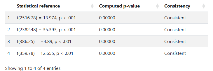
(In this example, the analyzed paper is dealing with very large population-level statistics, and the few results that are checkable are very large t statistics, computing infinitesimally small p-values. So, it all looks good.)
Unfortunately, StatCheck is also somewhat limited as a tool. It is not good with different publication formats, tables, or any esoteric presentations of even the simplest data — it works on American Psychological Association (APA) formatted papers only.
So, unless you are interested in papers within certain subsections of the social sciences, it will not be an immediate help. But when you have a correctly formatted paper, it is tremendous, and will save you a lot of time that otherwise would be spent on recalculation.
GRIM
Assessing means
GRIM stands for ‘granularity related inconsistency of means’. GRIM is a simple observation: given that many means are fractions consisting of a whole number divided by a whole number, a lot of decimals can’t exist as means.
GRIM is a quick and easy evaluation to make, especially considering it is available as an R function within the scrutiny package. Say we have 30 people who answer the question: “How do you feel today?” from 1 (terrible) to 7 (excellent) — in whole numbers, no partial numbers or fractions — and a paper reports a mean of 3.51.
This is impossible, and thus we can determine the stated result ‘fails GRIM’.
GRIM is already available in the R package ‘scrutiny’. Once that is available via:
install.packages("scrutiny")
library(scrutiny)
Then the ‘grim’ function can be called in a single line, specifying the value of interest and the sample size:
> grim("3.51", n=30)
 3.51
FALSE
Why false?
Because the answer is a fraction: X/30, where X is the sum of the answers to the ‘feeling’ question, and 30 is the number of people who were asked it. We can confirm this with primary school mathematics: it is possible for the answer to be 3.5 or 3.53, but not 3.51.
> 105/30
[1] 3.5
> 106/30
[1] 3.533333
With a little bit of inference, we can speculate on exactly what went wrong.
For instance, maybe someone left the question blank, and the denominator isn’t actually 30? Perhaps there’s a single missing value (n=29) or maybe two (n=28)?
> 101/29
[1] 3.482759
> 102/29
[1] 3.517241

> 98/28
[1] 3.5
> 99/28
[1] 3.535714
Neither of these produce 3.51 (but 102/29 would round to 3.52… if that was the solution, the authors would have failed to round correctly).
What if, against instructions, a participant put ‘3.5’ as how they feel?
> 105.5/30
[1] 3.516667
Also not possible — that’s 3.52.
What if some smart alec put a silly answer, like ‘3.3333’?
> 105.3/30
[1] 3.51
Well, that works perfectly. We should expect this, because if you allow the answer to the item in question to be any decimal, GRIM doesn’t work at all as any eventual mean is possible.
The ‘silly answer’ scenario is actually an analytical possibility you may have to consider — we have encountered this before in the wild when requesting data! But also consider that a silly answer might be straightforwardly impossible if, say, the question was answered on a computerized form that made you click a radio button corresponding to the digits of 1 to 5. There is no way that could be anything except an integer.
(Details like this are one of the many reasons why analysts get annoyed by papers that do not clearly specify their methods!)
The first preprint on GRIM was published in 2017, and we have used it to find a steady stream of means which can’t be explained since then. The most interesting cases are when people outside the forensic metascientific community are using the test for their own purposes — one recent example is from Bauer and Francis (2021), an expression of concern resulting from a report by Aaron Charlton to the journal Psychological Science. This EOC reports working through exactly the same logic we saw above:
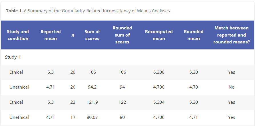
In this table, which is only a small part of the analysis, the authors analyzed a series of reported means, and found an anomaly. After doing so, they found several more (not shown). Eventually, the paper was retracted.
Reconstructing prevalence, and introducing percentages
We saw briefly above that the GRIM method (a) might find a mean / sample size pair that is impossible, and that (b) sometimes, we can also make a realistic attempt at discovering what the value should be. This is a useful observation, so in this section we’ll make it more systematic.
However, the concept is still simple: we simply run lots and lots of GRIM tests on a series of means, rather than manually working through testing a series of potential GRIM values, such as:
> grim(x = "5.27", n = 43)
 5.27
FALSE
> grim(x = "5.27", n = 44)
5.27
TRUE
> grim(x = "5.27", n = 45)
5.27
TRUE
> grim(x = "5.27", n = 46)
 5.27
FALSE
> grim(x = "5.27", n = 47)
 5.27
FALSE
We test for all of these, at once, for multiple values calculated from the same sample size.
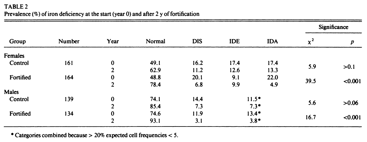
Figure 13:Table 2 from Ballot et al. 1989
We previously met Ballot et al. (1989) in the “Simple numerical errors: Summation” section, and flagged it because the paper never reported the initial cell sizes.
After that, we found an incredibly confusing reporting structure to the cell sizes in our initial analysis, where there were several stated or implied cell sizes, and all of them were different. Now, we’ll attempt to recover what those cell sizes might be.
A key observation here: percentages are also subject to the GRIM test, and they are more powerful than means. When analyzing means, GRIM is generally viable to use only when the number of interest is reported to at least 2 decimal places. But if a typically reported percentage is similarly rounded (i.e. a paper describing a mean of 5.62 and a percentage of 72.71%), then we have 4 decimal places, to play with, not two.
In GRIM terms, a mean reported as 0.85 is substantially inferior to a identical percentage with the same 2dp rounding (for instance, 85.39%). The same applies for 1dp rounding, where we can deploy GRIM with not 1dp but 3dp if a percentage is involved.
This is the case for Ballot et al. (1989). The first row of the table above lists four percentages, all of which need to be successfully recreated from fractions of 161 (49.1% of 161 must be a whole number, 16.2% of 161 must be a whole number, etc.) The easiest way to do this quickly is to test every reasonable sample size by simply using GRIM as many times as necessary. These samples are very likely the same or smaller than the stated sample size — less than 161 datapoints may be present, but more is very unlikely.
Again, as each proportion is mathematically identical to [0,0,0,0…1,1,1,1], we can simply test what amounts to the following for each proportion, and retain only the TRUE results as possible:
>   grim(x = "0.491", n = 161)
0.491
 TRUE
>   grim(x = "0.491", n = 160)
0.491
FALSE
>   grim(x = "0.491", n = 159)
0.491
 TRUE
>   grim(x = "0.491", n = 158)
0.491
FALSE
>   grim(x = "0.491", n = 157)
0.491
FALSE
>   grim(x = "0.491", n = 156)
0.491
FALSE
And so on. Rather than doing this manually, we use sapply.
  library(scrutiny)

  results <- sapply(1:161, function(x) grim("0.491",x))
  true_values <- which(results == TRUE)
  true_values
This leaves us with all the potential sample sizes for the first proportion, which are n=:
53 55 57 106 108 110 112 114 116 159 161 And checking the other two (grim(“0.162”,x) and grim(“0.174”,x) gives us n=:
   37    68    74    80    99   105   111   117   130   136   142   148   154   160
   23    46    69    86    92   109   115   121   132   138   144   149   155   161
And thus, our diagnosis: (a) n=161, the cell size for the row, is incorrect; and (b) there is data missing haphazardly within the samples, as there is no single n which can produce all three proportions. Every value fails the GRIM test at least once for every possible n.
This makes it very hard work (and presumably not of any great interest!) to try to re-create the chi-squared value provided in the table, as we have absolutely no idea what any of the cell sizes are for the items. If this was a modern paper, and on a subject of interest, this is the point where you would request the data from the authors.
Regardless the point remains: percentages of any binary yes/no answer are a great place to think about using GRIM.
Reconstructing contingency tables
Closely related to the above, we can also reconstruct contingency tables from row or column summaries, even if the reporting has a lot of the information removed. Take the following, which has a lot of the relevant information removed, and is then described in text:
INTERVENTION | CONTROL | ||
|---|---|---|---|
SICK | A | B | (A+B) |
WELL | C | D | (C+D) |
Total | (A+C) | (B+D) | (A+B+C+D) |
“The first dependent measure showed that 63.7% of participants in the intervention were well, compared to 44.9% in the control group (χ2(1,179) = 6.407*, p=0.011).”*
It was common in the social sciences, even comparatively recently, to report data in this very brief and featureless manner. This may be variously because of low standards in the field, or the ignorance of the authors, or sometimes as an active attempt to resist re-analysis.
Either way, this barrier can be defeated — we can check the χ2 calculation (see above), and GRIM can completely reconstruct this table by finding mutually plausible proportions.
To begin with, we know (A/A+C) = 63.7%, and (B/B+D)=44.9%. The total sum of all participants is 180. And, as for context we will test the entire range of values, we are also reasonably sure that the two groups are likely quite evenly balanced, as they were randomly assigned.
Thus, we can apply GRIM to the percentage figures given, using the same code given above.
Possible values for A are:
0.637 0.637 0.637 0.637 0.637 0.637 0.637 0.637 0.637 0.637 0.637 0.637
80 91 102 113 124 135 146 157 160 168 171 179 (Note: always check these solutions manually, because R does not round values in the traditional manner! In this case, the solution at n=80 is 0.6375 exactly, which we would typically round to 0.638.)
If we visualize GRIM’s ‘best guess’ for any given sample size, you can see the solutions eventually start to become more common as the N increases. In this case, the first solution is the first red dot below, at n=91.
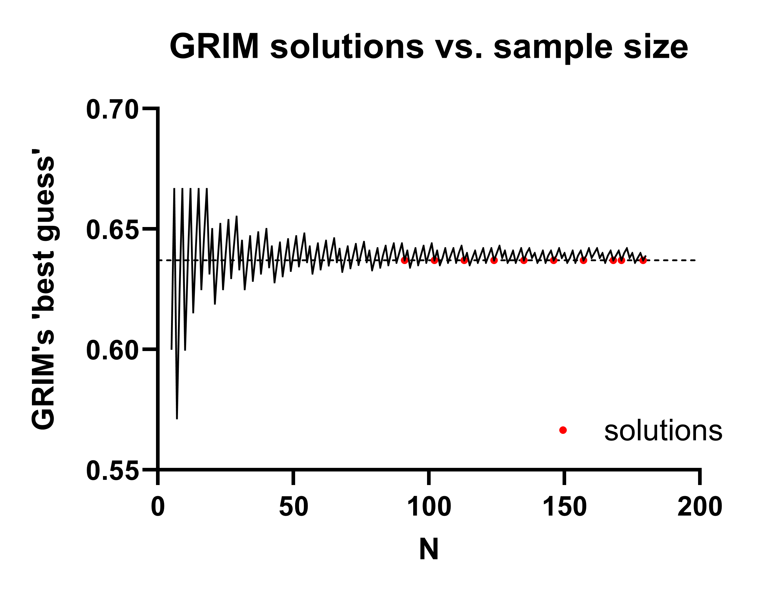
This is the only realistic solution in this example (the next solution, A+C=102, would imply B+D=79, which would be incredibly unlikely with a regular randomization procedure). Thus, A+B = 91, thus B+D = 89, at which point we can simply fill out the rest of the table:
INTERVENTION | CONTROL | Total | |
|---|---|---|---|
SICK | 58 | 40 | 98 |
WELL | 33 | 49 | 82 |
Total | 91 | 89 | 180 |
There are two further points to keep in mind here:
(1) Other examples may require more testing than this one, but it is common that GRIM can narrow down a sample size quickly to only a few possible cell sizes. If many potential solutions are found, the procedure is only slightly more complicated: then you recreate the statistical test using the potential solutions.
(When you do so, bear in mind that you may not know what test was used! Again, see the χ2 section above: the statistic may be calculated with Fisher’s Exact Test, or a chi-squared test of independence, which in turn may or may not use Yates’ Correction. So there are often three tests to try, unless the paper specifies exactly which to use.)
For more detail on an example like this, see my 2024 preprint.
(2) The number of decimal places provided strongly affects how many solutions you can generate. In the example above, with an assumed cell size ~90, there are many more solutions for 64% than there are for 63.7%. More decimal places in the reporting and smaller cell/sample sizes are required for this test to be effective.
RIVETS, and assessing ‘hand curated’ statistical tests
RIVETS stands for Rounded Input Variables, Exact Test Statistics. It’s something of a niche test, but it’s a very interesting observation. When it proves useful, it can be quite definitive.
RIVETS was originally conceived by Nick Brown to check for hand-calculated statistics, which it does in a very clever way — it looks at the likelihood that a test statistic is exactly equal to its calculation from truncated values.
That sentence is a little dense, so let’s use an example.
At baseline, the drug group (M=1.71, SD=0.22, n=25) was slightly taller than the placebo group (M=1.63, SD=0.40, n=25) but the difference did not reach significance (between-subjects t-test, t=0.876, p=0.385).
There is nothing incorrect about this test. It is correctly calculated. But it has an unusual feature.
In continuous data, decimal tails for any given value are usually quite long. When the mean and SD are truncated to 2dp, as they often are to be reported in a scientific paper, that information is redacted. In other words, papers typically present an approximation of statistical tests. In the above, we are comparing two groups which are actually:
Drug (M=1.705 to 1.714999…, SD=0.215 to 0.224999…, n=25) vs.
Placebo (M=1.625 to 1.634999…, SD=0.395 to 0.404999…, n=25)
If we encounter these descriptives in the text, we do not have an exact value for t and p, but rather ranges. And while the absolute differences between the potential hidden values may be small, they are almost always big enough to affect the precise value of the test statistic and the p-value! For instance, if we take the largest possible difference between the means (so, the highest version of the higher mean, and the lowest version of the lower mean), and the smallest possible standard deviations, we will produce the maximum possible test statistic and smallest possible p-value. The opposite is also true.
Our shorthand in this case is simply to prefix them with min and max. The nomenclature takes a little getting used to, but it dramatically simplifies things in the end.
Thus, the max difference between these two groups is found at:
1.71max (0.22min) vs. 1.63min(0.40min) thus t=1.0006, p=0.3220
And the min difference is found at:
1.71min(0.22max) vs. 1.63max(0.40max) thus t = 0.7554, p=0.4537
Even with these sub-2dp changes to the mean and SD, the t-statistic has changed by around a third.
So what does RIVETS do? It identifies the likelihood of the test statistic being exactly at the truncated values. It does this by assuming by sampling means and SDs anywhere within their possible intervals (so, for the first mean in the above, that would be anywhere between M>1.705 and M<1.715) and calculating how common it is for the test to return the exact p-value reported. Full R code to do this can be found in the RIVETS test on OSF, here.
Why would we care if the test statistic and/or p-value were calculated from truncated descriptive statistics? Because that’s how a researcher would hand-calculate them. Most people would simply use 1dp or 2dp if putting the values into a calculator. If a whole series of results is hand-calculated, it is often good evidence that someone was manually tinkering with the values.
(Note: RIVETS was a seminal observation about how uncertainty and data reporting standards. While it may not be deployed often, it contains a core principle that is critical to understand as the same calculation, used in the same way, can be used to establish the maximum and minimum possible test statistics. We will see this in a future section.)
GRIMMER
GRIMMER is GRIM but for standard deviations (GRIM + ‘Mapped to Error Repeats’). It’s sufficiently different to justify its own section, but it’s also included here after RIVETS (see above) for a reason.
The original idea was Jordan Anaya’s but the derivation we’ll use here was first outlined by Aurien Allard in 2018, and it’s extremely clever. I’ve borrowed his MathJax code here to show you the implementation.
To start with, we can take this standard definition of the sample variance:
If we expand the top line, we see:
But, the second term there is the sum of all the included values, as in, the numerator of the mean!
i.e.
So, if we rearrange and collect all of the above, we finally get:
And the final observation: the sum of all the squared whole numbers (i.e. the left hand side) is itself, obviously, a whole number, and thus, so is:
It’s awkward to write out in words, but it makes it even more approachable: (degrees of freedom * variance) plus (n * the mean squared) must be a whole number.
A function for this is also in the scrutiny package (see above) and has documentation here.
Let’s do a simple manual example in the meantime, though.
Previously in the GRIM section, we saw Bauer and Francis (2021) analyze a paper by Banerjee et a. (2012) which was later retracted. But that paper relied heavily on a previous report in Science which used a similar task, by Zhong & Liljenquist (2006).
This is a good paper to analyze for a few reasons: (1) it has over 1600 citations, which means it probably SHOULD be checked; (2) it measures ‘average number of words’ returned on a task — a good source of integers to test, as there is no possibility that a ‘half word’ could be reported, and (3) it has an annoying conversion from SEM to SD that presents an extra challenge. When I approached this paper, I initially assumed that there was a typo, and that 1.88 was the SD, NOT the SEM — if this was accurate, the SD would be equal to 1.88*sqrt(30), which is ~10.3 and clearly impossible.
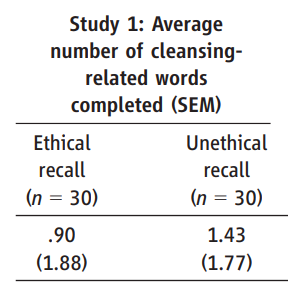
The code to resolve GRIMMER is extremely simple:
  n <- 30
  SD <- 1.88
  mean <- 0.90

  (n-1)*SD^2 + n*mean^2

## OUTPUT
[1] 126.7976
… and we’ve hit a big snag, which is the issue of reporting precision. This is why this section is included after the RIVETS section above, as exactly the same issue is relevant again — we have a range of potential means and potential SDs, rather than precise values.
But this is not a setback, rather, this is where GRIMMER starts to get really interesting. Why? Because (a) we can work around our precision loss by adding our potential decimal tails back in, and look to see if there’s any whole numbers in our possible range, and (b) having identified a whole number solution, we can potentially produce very accurate answers about what our original numbers actually are!
  library(ggplot2)

## set up the basic parameters, and a place to park the results
  n <- 30
  SD <- 1.88
  mean <- 0.9
  results <- numeric(1000)

## spoof in the imprecision for each calculation, and calculate
  for (i in 1:1000) {
    random_SD <- SD + runif(1, -0.005, 0.005)
    random_mean <- mean + runif(1, -0.005, 0.005)
    results[i] <- (n - 1) * random_SD^2 + n * random_mean^2
  }

## sort the results, so they don't look like a messy squiggle
  results_sorted <- sort(results)

## place results on a single line graph
  ggplot(data.frame(x = 1:1000, y = results_sorted), aes(x = x, y = y)) +
    geom_line() +
    labs(title = "Line Graph of GRIMMER results", x = "Sorted Iterations", y = "Calculated Value") +
    theme_minimal()
Executing the above, we produce a graph that looks like this:
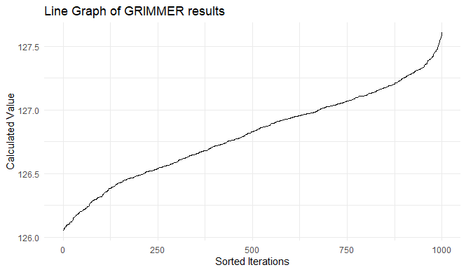
And we can confirm that the sum of the squared values (the left hand side of our GRIMMER equation) is overwhelmingly likely to be 127.
In the past, we have never needed any further analysis beyond this, although a future extension certainly is possible: it might be possible to prove that some combination of:
- the mean
- the standard deviation
- the sample size, and
- the sum of squared values
… is impossible i.e. that any given sample cannot form the identified sum as an integer while maintaining the defined sample properties!
(However, an epilogue in this case: we will see later in the SPRITE section that the assumption we made above, that the SEM was stated incorrectly, was correct… but our assumption of how it was incorrect was wrong.)
Tests for p-values
In medical research in particular, when multiple samples are compared, it is standard practice to lay out a ‘Table 1’ which describes the baseline characteristics of the 1 or more samples included in the research. Here is an example:
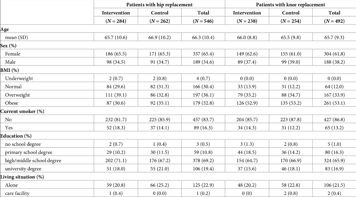
Figure 17:A paper chosen completely at random. “Cost-effectiveness of a patient-reported outcome-based remote monitoring and alert intervention for early detection of critical recovery after joint replacement: A randomised controlled trial.” Schöner et al. 2024. Schöner et al. (2024) Note that in this case the ‘Table 1’ is actually Table 2.
With the data laid out in this format, we have a certain degree of transparency that allows us to get a holistic sense of the research participants. We see both strong similarities (say, the age of an experimental sample vs. a matched control) and strong differences (say, the pancreatic enzymes of a sample with pancreatitis vs. a matched control).
Having established this picture of the dataset, researchers often proceed to analyzing it, and a lot of statisticians are very vocal that they shouldn’t. Since Rothman (1977), statisticians have criticized the row-wise analysis of these numbers to give it a name: The Table 1 Fallacy.
From a recent paper (Sherry et al. 2023): “… engaging in significance testing of baseline variable distributions after sound randomisation is not informative, since any baseline variable differences following unbiased randomisation are already known to be due to chance; in other words, significant findings are, by definition, false positives.”
This is perfectly sensible, but the language above in bold is important: there is no fallacy if the numbers included are incorrect, mistyped, or fraudulent. Using the Bartlett’s Test and the STALT test, we can analyze any congruent p values, no matter what test produces them. However, these are typically used to analyze Table 1 values, and both raise serious red flags if the tests are significant on Table 1 values in particular.
(Thus, while many medical journals in particular are moving away from this rather nonsensical analysis of Table 1, we are in the strange position of knowing that it is technically uninformative to report statistics calculated row-wise from a Table 1, but but also hoping that authors and journals report these uninformative statistics as often as possible, because these ‘meaningless’ tests give us a window into the underlying trustworthiness of the paper.)
Assessing p-values with STALT
STALT stands for ‘Smaller Than A Lowest Threshold’. This is barely a technique, more of an observation about recalculated test statistics (see Data Techniques: Recalculation). However, it is important enough that it gets its own section, and has its own preprint as well (Heathers and Meyerowitz-Katz, 2024).
Often, statistical results of simple tests are reported like this:
Using a between-subjects t-test, Group A (mean=5.5, SD=2.1, n=125) was confirmed as smaller than Group B (mean=10.1, SD=1.9, n=131), p<0.05.
This is all correctly calculated (according to NHST theory, at least), but it is almost lying by omission. A crucial detail has not been included — how much smaller the p-value is than 0.05.
Reporting like this might lead people to imagine that the result presented might be p=0.03, or maybe p=0.01, or p=0.008. It isn’t. As we’ve now established that it’s easy to re-create between-subjects t-tests, calculate the above now yourself: what might the p-value be?
From the above we can calculate t=18.79 and df=254, thus the actual p value is: ~3*10-50.
In some experimental contexts, this is extremely unlikely. In other contexts, p-values can be legitimately very small — but in those areas (e.g. genetics) they are not typically reported as ‘p<0.05’ but in scientific notation, e.g. ‘p=3.7e-10’.
That being said, an analyst needs to use a good deal of subjective judgment as to whether or not an extremely small hidden p-value is problematic.
To deal with STALT values, you need to either use software that allows you to calculate p-values analytically (R, as we saw above, works just fine), or use an online calculator capable of returning the long rather than the truncated answer of a statistical test (a good one is available here).
As might be expected, we generally but not exclusively see STALT errors in large-but-hidden treatment effects. They can also be spotted in large baseline differences between intervention and control groups occasionally.
EXAMPLE OF A STALT VALUE IN AN UNUSUAL TREATMENT EFFECT
The paper “Comparison of the Effect of Nifedipine Alone and the Combination of Nifedipine and Sildenafil in Delaying Preterm Labor: A Randomized Clinical Trial” by Mohammedi et al. (2021) was passed along to me in a conversation about trial accuracy results, after the below raised a flag:

Figure 18:Manouchehri et al. (2024). Always question forest plot outliers!
Meta-analyses are great places to find flags, because someone has done the hard work of assembling all the effects for you in one place. This forest plot above tells us that Mohammadi et al. (2021) — the study on line 3 — found that a drug combination given during pregnancy when there is a risk of premature delivery increases the baby’s weight by more than a pound. In a four pound newborn that is worth questioning, because if it’s true, it’s an amazing win for pediatric health.
The birth weight data shown above increased (presumably) because the amount of time for gestation during the study period also increased (16.17 ± 5.14 days in the intervention group, and 9.98 ± 3.50 days in the control group). Both groups are n=66, and the p-value is given as <0.001.
Here, we can recalculate the p-value using the same code as the above section on t-tests:
library(stats)

mean1 <- 16.17
sd1 <- 5.14
n1 <- 66

mean2 <- 9.98
sd2 <- 3.50
n2 <- 66

t_stat <- (mean1 - mean2) / sqrt((sd1^2 / n1) + (sd2^2 / n2))
df <- n1 + n2 - 2
p_value <- 2 * pt(-abs(t_stat), df)
p_value

# OUTPUT
[1] 3.734256e-13
This is extremely concerning for the accuracy of the paper. Having found the above, there were unfortunately several more untrustworthy data features.
Two logical additions to STALT are (a) using a random sampling method to estimate how substantial a difference between two or more groups have to be in order to produce the published result, and (b) where possible, calculating an effect size.
An interesting wrinkle of STALT values is that researchers themselves may be producing them by accident. Many statistical platforms only offer truncated p-values, so it is entirely possible that if researchers input unlikely, inaccurate, or fake data to their calculation method of choice and receive “p<0.001”, in doing so they themselves are never aware that the true p-value is, say, p=5e-18.
Analyzing multiple Table 1 p-values with the Carlisle Stouffer Fisher test
Unlike other tests presented here, this is not a single method, but rather a collection of related tests and applications. However, all of them have the same focus: calculating an omnibus value from the output of multiple independent statistical tests. The most common names are:
(That last paper cites this as the ‘Carlisle-Stouffer-Fisher method’, so we’ll use that terminology; CSF)
These are variations on a theme, and all solve the same problem. Consequently, all suffer from the same central issue: a omnibus test for p-values deployed like this is designed to assess independent p-values. Say, for instance, we have a Table 1 that lists age, height, weight, and BMI. These are all mutually non-independent!
- We know people get heavier as they age
- We know taller people weigh more
- We know that BMI is a straightforward function of height and weight
If these four variables were correlated, every value in the correlation table would very likely be positive and a minimum of r~=0.3 (with some a lot higher). This could dramatically increase the likelihood of the CSF test reporting a false positive.
However.
As we saw in the STALT section, there is a place where the practical application of forensic metascience tests meets the statistical assessment of them, and the analyst is forced to use imperfect tests judiciously. In Carlisle’s original research on suspicious papers, 43 of them returned a p-value from the CSF method was less than 1e-15. Thus, while we cannot correct for the non-independence of the p-values, this is an incredibly strong signal that something is amiss, as the likelihood of even imperfect and highly multicollinear data returning this p-value is practically zero.
(It would make a good Masters project to determine exactly how much the expected Table 1 interdependency affects the use of this test on real-world data.)
Calculation of the CSF test using Fisher’s traditional method is straightforward. To put this into context, we can use a famous retracted paper by the researcher Yoshitaka Fujii from 2005. Because the paper is heavily defaced with the RETRACTION notice, I have recreated the table below so you can see it:
Table 5:Fujii and Shiga (2005), Table 1.
25mg (n=30) | 50mg (n=30) | 75mg (n=30) | 100mg (n=30) | |
|---|---|---|---|---|
Mean age (SD) | 41(12) | 41(12) | 41(12) | 42(12) |
Sex (M/F) | 15/15 | 16/14 | 15/15 | 16/14 |
Mean height (SD) | 161(8) | 161(8) | 163(8) | 162(10) |
Mean weight (SD) | 57(10) | 58(10) | 59(9) | 59(10) |
Mean initial dosage (SD) | 29(4) | 29(5) | 30(5) | 30(5) |
This data is from a (fabricated) paper where medical outcomes while taking propofol, a powerful anesthetic, were modified by simultaneously treating patients with a second anti-inflammatory drug.
It should probably not come as a surprise that these numbers are visibly homogenous. In a situation like this, the CSF test attempts to quantify that homogeneity. As the different rows imply the use of different straightforward tests, we simply apply a reasonable test to each row.
(Note: there might be a built-in function to calculate the one-way ANOVA from summary statistics which doesn’t involve writing out all the steps! The below still works, though.)
# R code to reproduce a one-way ANOVA from summary statistics
# James Heathers, 10/24

# load the necessary library
library(stats)

# define the parameters
n <- 30
means <- c(41, 41, 41, 42)
sds <- c(12, 12, 12, 12)
k <- length(means)

# calculate the total observations
N <- n * k

# calculate the overall mean
overall_mean <- sum(means) / k

# calculate the between-group SS
SSB <- sum(n * (means - overall_mean)^2)

# calculate the within-group SS
SSW <- sum((n - 1) * sds^2)

# calculate the degrees of freedom
df_between <- k - 1
df_within <- N - k

# calculate the mean squares
MSB <- SSB / df_between
MSW <- SSW / df_within

# calculate the F-value
F_value <- MSB / MSW

# and finally, calculate the p-value
p_value <- pf(F_value, df_between, df_within, lower.tail = FALSE)

# thus, the p-value and F-value:
F_value
p_value
This returns a very small F-value (F=0.0521) and a very large p-value (p=0.9842)! We can repeat this for all the relevant lines thus:
Table 6:The p-values from the above. * used a chi-squared test of independence
p-value | |
|---|---|
Mean age (SD) | p=0.9842 |
Sex (M/F) | p=0.9875* |
Mean height (SD) | p=0.77 |
Mean weight (SD) | p=0.8335 |
Mean initial dosage (SD) | p=0.7251 |
Now we have our p-values, we can use Stouffer’s Test which is already in the R library meta, as it has some obvious uses in traditional meta-analysis.
# R code to calculate Stouffer's Test
# James Heathers, 10/24

# grab the necessary library
library(meta)

# input p-values
p_values <- c(0.9842, 0.9875, 0.77, 0.8335, 0.7251)

# convert p-values to z-scores
z_scores <- qnorm(1 - p_values)

# Stouffer's Test
stouffer_test <- sum(z_scores) / sqrt(length(z_scores))

# calculate the omnibus p-value
combined_p_value <- 2 * (1 - pnorm(abs(stouffer_test)))
In this case, we get p=0.002749.
So far, these calculations have been quite straightforward, but now we have reached the hard part: assume we saw this paper before it was retracted, and before we knew Fujii would accrue a total of 172 lifetime retractions, making him the second most fraudulent researcher in human history.
How should we make a decision about the trustworthiness of this paper if our (admittedly imperfect) test has returned a p-value of ~0.003?
The answer, unfortunately, is ‘it’s tricky’. There are some issues to consider:
- Just exactly how small is the p-value?
- Are there other errors in the paper?
- Are there similar CSF errors in papers by the same author/s?
- What are the calculated equivalent values of other studies in the same area?
We have encountered situations where:
(a) an value of this magnitude (or greater, think p=10e-15) is one amongst many incongruities in the paper, the researcher is being investigated for widespread fraud, and several studies by different authors in the same field return much more regular p-values from Stouffer’s Test…
But also where:
(b) the CSF error is moderate in magnitude (e.g. p=0.01) found in isolation, appears not too materially different from other papers in the area, and we have no suspicions about the author.
In Fujii’s case, it was easy: investigators found dozens of other similarly unlikely papers and concluded quite quickly that the baseline values were fabricated.
In summary: the CSF test is easy to calculate, and has a good rationale for use, but be careful with using it in isolation, because it absolutely must be interpreted. There is *no robust point *where you are allowed to assumed that you are dealing with erroneous Table 1 data.
Finally, there also is very likely a particular problem involved in mixing continuous and categorical data together into a Table 1 analysis (which is exactly what I have done above, in anticipation of the next section).
Bayesian Table 1 analysis
An intriguing alternative to the above is using a Bayesian framework to deploy essentially the same observation. However, in this framework, the frame would be the dispersion of the p-values. While this method is yet to be fully established in testing on real-world examples that can later be investigated in the context of the raw data that produced the offending Table 1 data, it is worth including in the mainline tests here as:
(a) It ameliorates the problems of the above with regards to ‘mixing’ categorical and continuous tests.
(b) It has a handy Shiny app that will allow you to easily recreate the same test as per the above, complete with sample Excel sheets to format the data correctly, and an accompanying paper (where you can also find the R code to run it locally).
An example is probably more illustrative here. By modifying the sample data provided with the code, we see below a sample Table 1 for 11 variables (V1 through V11), where there are very similar group means.
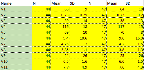
Figure 19:Modified sample data for Bayesian Table 1 analysis, with very similar means.
Running this through the model produces a substantial *under-*dispersion (where the cumulative density function of the expected t-values is significantly steeper than resampled models would indicate). The smallest p-value is 0.62.
The precision multiplier is (where <1 indicates over-dispersion or lower precision, and >1 under-dispersion or higher precision) is 10.11, 90% CI 4.34 to 20.5. In short, it is very likely that a non-random process generated the Table 1 data.

Figure 20:Under-dispersed Table 1 data — a big red flag!
It is likely that this method — or another like it with a strong theoretical justification for including both continuous and categorical calculations in the same assessment — will figure heavily in the future analysis of Table 1 data.
Data Reconstruction
Analyzing the underlying data of a scientific paper is the easiest way to check its trustworthiness, but (a) this data is often not available with the published paper, (b) this data may not even be available elsewhere, (c) researchers generally ignore requests to see data, even if it is subject to an open data policy at a journal. forensic metaanalysts would develop and use completely different tools if raw data was always available.
However, papers often have features which allow data to be reconstructed, even from scant details. There are several methods by which this can be done. These reconstructions are often not precise, but rather simulate what data behind features of a paper *might* look like. However, this hypothetical data is often enough to retrieve signals of trustworthiness.
Converting between mean (SD) and median (Q1-Q3)
Different measures of central tendency can be used to approximate each other. Unfortunately for analysts, this is a fact that feels more useful than it is, and is rarely deployed in analysis.
There are two primary reasons for this:
(1) any such conversion is imprecise and produces an approximation, and there is no work we can do to produce increasingly exhaustive or more complete analysis to those approximations; and
(2) the measures of central tendency and dispersion initially used were probably chosen because they were more appropriate for the analysis presented, which means our reanalysis probably begins from figures that are imprecise (see above) and then proceed to violate statistical assumptions about them.
It is easy to see how this conversion might allow different investigative options — for instance, say a Mann-Whitney U test for independent non-parametric samples is reported as median, quartile, n and p-value, and is also somehow suspicious; you could conceivably convert to mean(SD) and use a parametric test.
But in general, the amount of assumptions layered into performing that conversion make it uncomfortable to do so, and our standards for proof of anomalies are quite high. Many methods here are conclusive proof of a data anomaly, this one is not. However, if it is of interest, there is both an online and an offline calculator available for this conversion via a recent popular paper.
This is included here because there is a likelihood that the method could be responsibly deployed in future, and because it has such a broad range of potential uses. To deploy it, someone will have to (1) fully characterize the distribution they are trying to recreate with data from a similar measurement or measurements derived from elsewhere, (2) compare the Wan et al. (2014) method with others specific to the expectations of that data, and only then (3) proceed to use the conversion to do analysis, and use that analysis to compel access to underlying data and confirm the finding it implies rather than assume anomalies have been detected.
Reconstructing sample data from descriptive statistics using SPRITE
SPRITE is an iterative technique used to reconstruct samples from reported integer data. It is extremely simple, and can be easily explained with a worked example.
Consider the output of two survey questions, both given to n=30 people, who return a rating between 1 and 7. There are two items: (1) mean = 5.33, SD = 1.12 and (2) mean = 4.5, SD = 2.81.
It is likely that most scientists would see these and not be alarmed. They ‘look about right’, as in, they don’t have an unusual features: an SD of 10 would — hopefully! — make an interested reader sit up and pay attention in a way these figures do not.
However, there is a hidden feature which is not apparent until we use SPRITE to reconstruct the data.
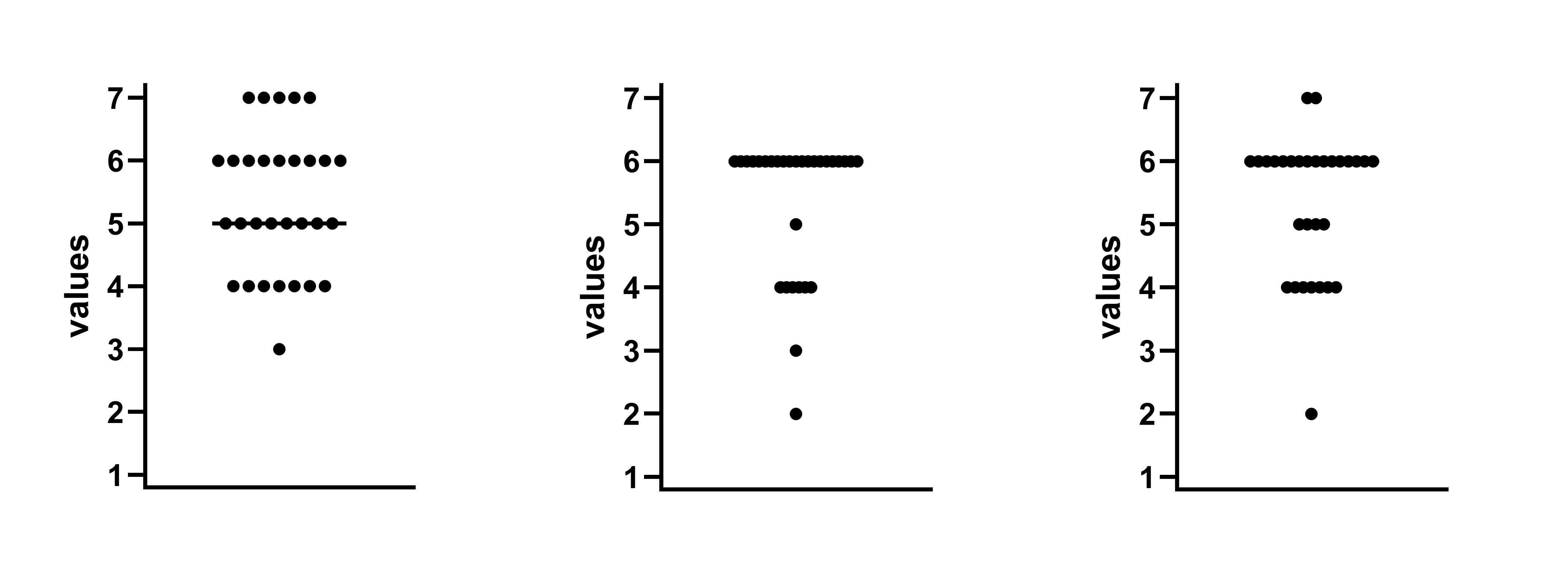
Figure 21:Dot plots of sample data where mean=5.33 SD=1.12. These all look similar and reasonable.
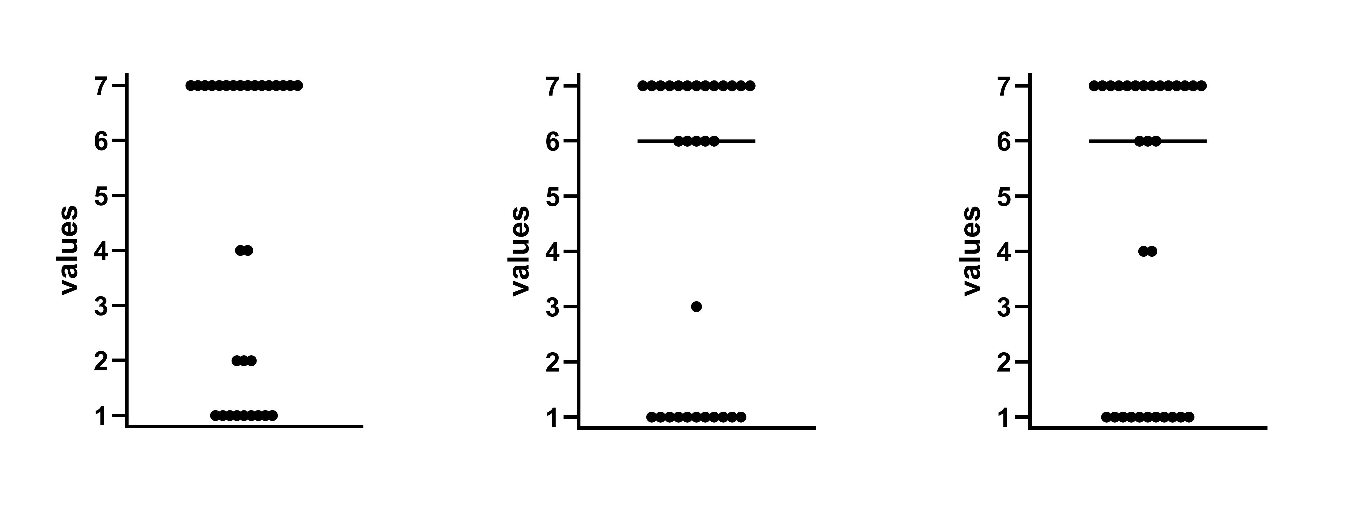
Figure 22:Dot plots of sample data where mean=4.5 SD=2.81. These look like extremely unusual samples, unless the question being asked is a very polarizing one!
SPRITE typically returns sample data by:
(1) determining the sum of all the elements (in our first sample about, this would be 160, as 5.33 x 30 = 159.9, and this can be rounded up to the nearest integer — bear in mind, for small samples with discrete values, data you try to SPRITE may fail GRIM before you can even start!)
(2) placing that sum into a distribution with the correct mean (i.e. dividing the sum of scores (160) into 30 separate bins according to a rule)
(3) shuffling those values to modify the standard deviation up or down (for instance, say two values were [3, 3], the algorithm might shuffle them to [2, 4], or [1,5], which preserves the mean but increases the SD).
(4) repeating the above so that a random walk towards the correct mean / SD pair is observed
Any distribution can be used as a starting point (uniform, normal, max SD, min SD, triangular, etc.) If a sample is unusual, the solutions provided by any distribution will end up producing the same unusual data. But if the sample is not, different starting distributions will provide a series of different solutions, and give the analyst several possibilities for what the data might look like.
Even though SPRITE works on integer data, it is trivially adapted to produce solutions for numbers with decimals by using 10x or 100x the values of interest, then dividing the result. The amount of time it takes the code to run will be dramatically longer, though.
Like many of the other analysis methods here, SPRITE has its own excellent R package.
Cast your mind back to the previous STALT section — remember Zhong and Liljenquist (2006), who returned an incredibly confusing series of values for ‘word completion’? As it turns out, that paper actually has a correction, but the correction isn’t actually appended to the main paper (just listed as an errata).
We thought the SEMs (reported to be 1.88 and 1.77) might be the SDs. But this was not the case, there was a different mistake, the SEM values were actually 0.188 and 0.177. We can trivially turn those into SDs (1.03 and 0.97, respectively).
Given this new information, we can resolve the discrepancy around these values with just a few lines of code and rSPRITE.
(Note: the min value is implied, as count data can’t be <0, and the max value is the highest possible number from the listed scale.)
library(rsprite2)

sprite_parameters1 <- set_parameters(mean = 0.9, sd = 1.03, n_obs = 30, min_val = 0, max_val = 100)
find_possible_distribution(sprite_parameters1)

sprite_parameters2 <- set_parameters(mean = 1.43, sd = 0.97, n_obs = 30, min_val = 0, max_val = 100)
find_possible_distribution(sprite_parameters2)
That’s all there is to it. This returns straightforwardly plausible sets of values, thus:
# Group 1
3 4 2 2 2 0 2 1 1 1 1 1 1 1 1 1 2 0 0 0 0 0 0 1 0 0 0 0 0 0
# Group 2
2 0 2 1 3 3 3 3 1 1 1 3 1 1 1 1 1 1 1 1 3 1 1 1 1 1 1 0 3 0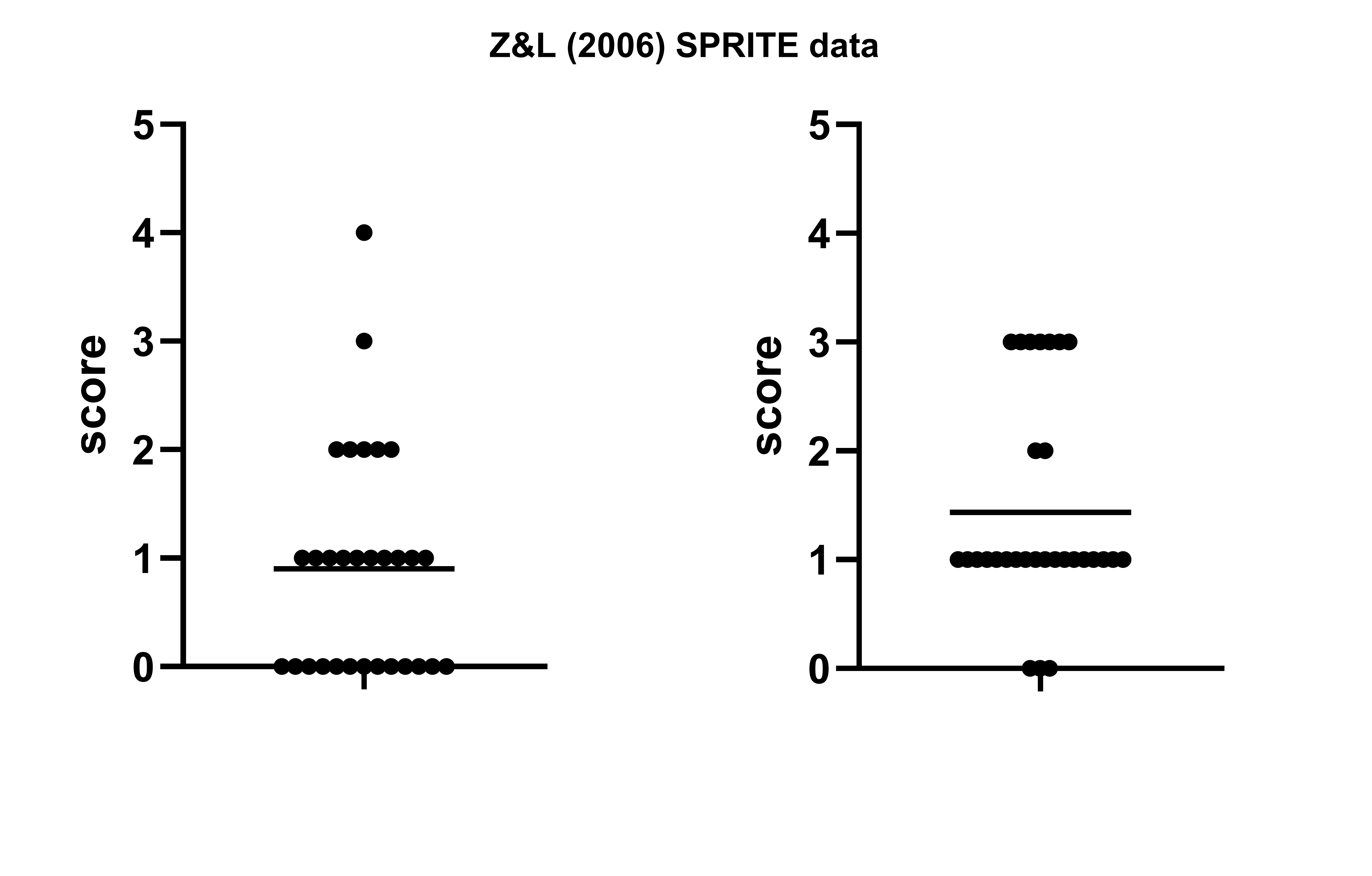
One final thing to mention: SPRITE has a cousin, which performs essentially the same function (i.e. recreating a defined dataset of integers) called CORVIDS. Rather than reconstruct a series of plausible data sets one by one via random walk, CORVIDS reconstructs every possible dataset via Diophantine equations. Due to the computational requirements, this is very slow at larger sample sizes. CORVIDS might be considered if an analytical solution is required for a fairly small sample.
Correlation and regression
Analyzing regression coefficients with DEBIT
DEBIT, another one of our published tests, is somewhat niche. However, it has a wide enough applicability that it’s worth including. Yet again, there is a simple observation at work: the mean of binary data is completely determined by the SD and vice versa.
It is very common to give present/absent values in a regression table 0 or 1 values, and then report the variable as a mean and standard deviation. In larger regression tables, there may be several dozen of these variables.
From our original preprint on this test, the derivation:
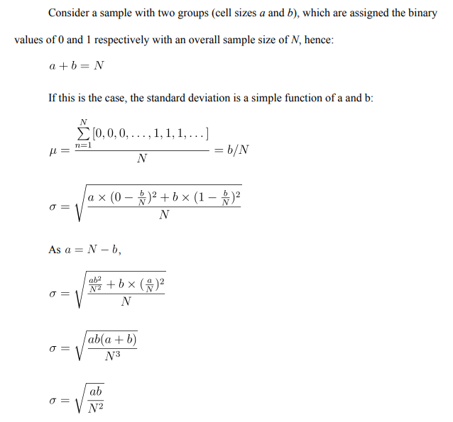
At this point, as the mean is ‘all the ones’ divided by the sample size, and ‘all the zeroes’ is simply ‘the sample size minus all the ones’, we can turn this into the sample standard deviation (not the population standard deviation) thus:

Let’s look at an example. Regnerus (2012) was, at the time of publication, an extremely controversial paper. It concludes in part:
When compared with children who grew up in biologically (still) intact, mother– father families, the children of women who reported a same-sex relationship look markedly different on numerous outcomes, including many that are obviously suboptimal (such as education, depression, employment status, or marijuana use). Regnerus (2012).
… so it’s quite easy to see why! The paper was criticized, supported, investigated by the University of Texas, and eventually cleared of wrongdoing.
However, they missed something. As this controversy of this paper erupted well before DEBIT was formalized, no-one at the time thought to check the huge raft of binary coded variables reported in the Table 1. All three parts are gathered together below:
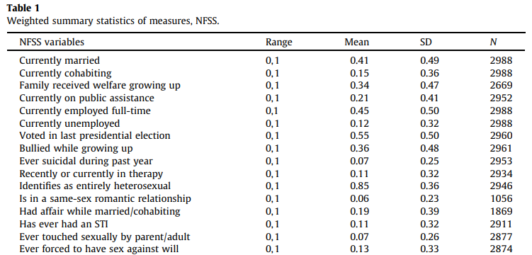
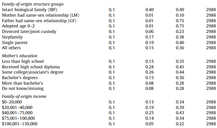

DEBIT can check all of these at once, if we have the patience to type them in.
But: look carefully. Without using DEBIT at all… can you see which variables might be a problem?
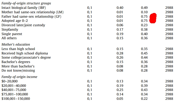
If the mean is 0.01, DEBIT tells us the SD will be approximately equal to (0.01*0.99)^0.5 which is 0.1, and very much not 0.75.
In fact, an SD of 0.75 is impossible in binary data. We don’t even need to run the full DEBIT test. Like many of the other tests here, this is also implemented in the Scrutiny package.
When we run this test, we can inspect several test outcomes at once and see them on a ‘DEBIT graph’, which places the a/b ratio and the SD relationship on a plane, and includes boxes rather than single point values for possible values.
If we go to the trouble of inputting all the numbers, the DEBIT test even flags the impossible values on the plane in red, if there are any (see below)
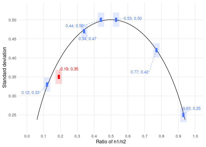
Figure 30:https://
Finally, an interesting wrinkle for further development — there may be some other DEBIT-like properties which compare the proportionality of means and SDs across multiple articles or at a journal level. Schumm et al. (2018) made an interesting initial attempt to establish this (and before the DEBIT test was formalized, too). Further work on this would make a good Masters-level project.
Reconstructing a correlation table using MVRNORM
Correlation tables contain rich hidden details. Venables and Ripley’s MASS (“Modern and Applied Statistics with S”) contains a function for simulating samples from a specified multivariate normal distribution. The function details are viewable here.
A worked example is given below.

Figure 31:Table 2 from Gino, Sezer, and Huang (2020) LINK
(I’m afraid situations like this require a lot of typing things in. Sorry about that.)
# R code to reproduce sample data from a table of correlations
# James Heathers, 09/24

library(ggplot2)
library(MASS)

# input the descriptive statistics for rows

mu <- c(4.40, 4.67, 2.6, 2.4, 5.75, 3.07, 5.03)
stddev <- c(1.28, 2.25, 1.33, 1.53, 1.08, 1.48, 1.00)

# input the figures from the correlation matrix (cormat)

cormat <- matrix(c(1,0.12,0.16,0.25,-0.28,0.48,-0.16,
0.12,1,0.13,0.05,-0.05,-0.002,0.11,
0.16,0.13,1,0.37,-0.30,0.20,-0.32,
0.25,0.05,0.37,1,-0.55,0.52,-0.65,
-0.28,-0.05,-0.30,-0.55,1,-0.46,0.59,
0.48,-0.002,0.20,0.52,-0.46,1,-0.45,
-0.16,0.11,-0.32,-0.65,0.59,-0.45,1),ncol = 7)

# calculate the covariance matrix (covmat)

covmat <- stddev %*% t(stddev) * cormat

# simulate from a multivariate normal distribution (mvrnorm)

sim_data <- mvrnorm(n = 301, mu = mu, Sigma = covmat, empirical = TRUE)

# view the output of the simulated data (sim_data)

colMeans(sim_data)
cor(sim_data)
sim_data
It may be possible to generate the above with constraints (i.e. with variables defined by a stated min/max, or with a specified decimal structure). If this is of interest, the code can often be looped until acceptable data is reproduced, but this will still often not resolve into usable data. Until this technique is better understood, it remains promising but very open-ended, and should be designated only for exploratory investigation.
Visual Techniques
More problems with published papers have been noticed via detection of similarities, differences, or impossibilities within visual elements than all other techniques combined. A whole separate textbook could be written on the recent and growing history of visual analysis, particularly in the life sciences, and I am the wrong person to write it. However, this text would be incomplete without briefly outlining what is possible. The emphasis in the below is given to sections where a visual technique might return us data that is locked behind the image present, where further analysis could be attempted.
It is not particularly surprising that visual analysis is so effective, as when raw data is not uploaded with papers but is included in visual form, pictures and graphs are usually the most richly detailed features included in any given paper.
Features of interest to the analyst includes but are not limited to:
- scatter plots (i.e. XY plots)
- line graphs
- column graphs
- micrographs
- Western blots
- etc.
Often, the method for performing visual analysis is simply the human eye, skill, and experience. ‘Looking at it carefully’ will still be the dominant method for detecting anomalies for many years to come, because (a) humans are very domain-agnostic, and visual analysis tools are not, and (b) your ability to synthesize, update, and codify classes of visual anomalies that will help you become a better analyst is superior to any congruent machine learning technique.
Software, however, is still a vital tool for anomaly detection, and a variety of tools are available to retrieve visual data from published papers. For those of us with no particular talent for visual analysis (like me!) these resources are mandatory.
Scatter plots (XY data)
Scatter plots are often rich data sources which can allow both correlation or regression statistics to be retrieved, but also allow means and standard deviations to be recalculated.
A variety of tools that allow data retrieval are available.
- WebPlotDigitizer (browser based tool)
- Plot Digitizer (browser based tool)
- ScatterAct (Python)
- metaDigitize (R)
Beyond reconstructing regressions and summary statistics, other observations are also possible.
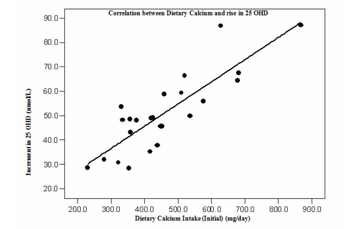
Figure 32:Vitamin D supplementation and bone mass accrual in underprivileged adolescent Indian girls. Khadilkar et al. 2010. PMID: 21147706
This work investigates the effect of vitamin D supplementation on bone mineral content in underprivileged adolescent girls. As the text does not provide means and standard deviations, we may wish to retrieve them. Using Plot Digitizer, we can upload the image above, and use the tools to manually identify each point.
Below in Figure 2, we can see a list of XY coordinates for the selected points on the left hand side, and the identifiable points on the X and Y axis on the right, which are used to set the axis values (and therefore calculate the points). The white dots that are visible are the user-specified points. The cutaway section in the top right is used to finely align the dots.
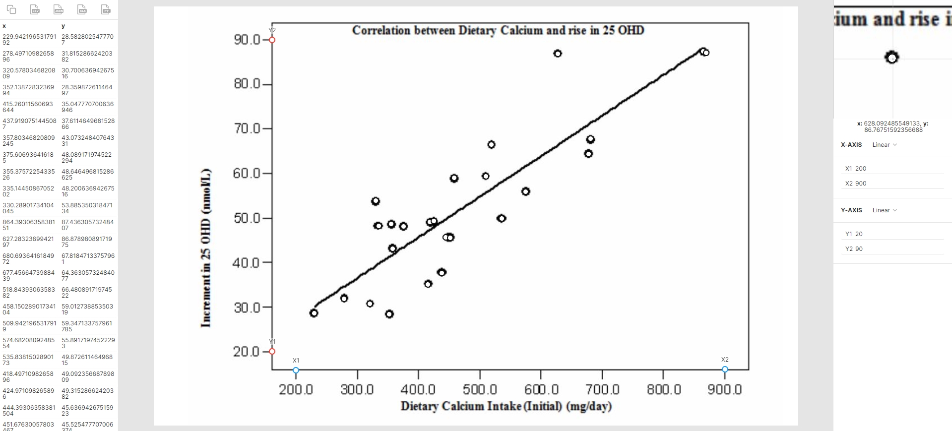
Figure 33:The above data panel, captured from Plot Digitizer.
Having retrieved the data, it can be downloaded in a variety of standardized formats, and looks as expected:
x | y |
|---|---|
229.94 | 28.58 |
278.50 | 31.82 |
320.58 | 30.70 |
352.14 | 28.36 |
… |
The paper cites the median of X as 438 (IQR=354-555). From the data above (n=25), we get 441 (355-575). While this lacks precision, it is very close to the paper values.
(With some techniques, a certain degree of imprecision is inevitable. This one of them.)
The paper does not cite the median of Y, as it is the difference between two calculated values (the change in 25 OHD values). It does specify that it changed (i.e. from 24.5 (12.7-33.2) to 75.2 (64.2-85.5)) but did not quantify that difference. However, we can calculate it as 49.2 (43.1-64.4), which is plausible.
The paper also reports the correlation between these two variables as r=0.8. However, it is re-calculated as r=0.89 (Pearson). In a broader analysis, this is weak evidence of a problem — the numbers are at least similar — but would serve as a flag. (In this case, there are further problems. See the section below 'Other Visual Features’).
Photographs
Photographs which are pixel-identical are obviously not describing two different situations. This may be within or between papers. These duplications are most commonly seen in (a) animal experiments in the life sciences, and (b) pictures of structures in material science.
Figure 34:Figure 6b in Wu et al. (2024), which was recently retracted at the time of writing. The two center mice in this panel of biofluorescence data are the same. In fact if you look carefully, they are completely the same.
Western Blots, Micrographs, and Flow Cytometry
Visual techniques are the best-established method of public error detection, and within the different visual features, the detection of editing and/or duplication of Western Blot figures is easily the most prolific.
Within ‘image forensics’, Elizabeth Bik — who has done a truly comprehensive amount of work in the area — has created a typology for these errors, which other researchers have since adopted.
Image duplications may be classified variously as:
Category 1: simple duplication
Figure 35:From Bik (2019), below. Simple duplicated Western blot lanes.
Category 2: flipped, rotated, or shifted
Figure 36:From Bik (2019), below. The same micrograph shifted and used twice.
Category 3: multiple internal or external duplicated sections.
Figure 37:From Bik (2019), below. Multiple clusters of repeated points in the same flow cytometry data.
The three categories contain an implied level of culpability — it is possible to have a Category 1 error made by accident (and there are many examples of this happening!), while a Category 3 error is very likely a deliberate attempt by authors to deceive the journal or reader. Imagine what circumstances would have to occur for Figure 16 about to occur by accident!
This typology was introduced a decade ago, and there has been no reason to revise it since. You can read about it in full, and I strongly suggest you do if this area is of interest, here.
Hand-drawn / manual features
All graphical programs maintain nearly perfect consistency between visual elements. However, this does not mean that figures will always be perfect if generated by automated means, and a variety of anomalies may be introduced to figures before publication. Examples include visual elements being moved, mismatched font or axis sizes when embedding, and compression artifacts. These may occur during the preparation of a paper or be introduced into a paper after acceptance by the authors, the copy editors, or the journal.
But there are also certain visual features that will never appear unless they are manually altered. These are many and various, and there are no absolute rules for their detection. But they can usually be detected simply by close inspection, especially as many of them are just odd.

Figure 38:Previously we met Vitamin D supplementation and bone mass accrual in underprivileged adolescent Indian girls. Khadilkar et al. 2010. PMID: 21147706. If the scatter plot is inspected carefully, you can see that the individual points are a range of different sizes. This is vanishingly unlikely to be due to anything except the manual alteration or construction of the graph. It is not necessarily a problem to hand-draw a graph, but it raises the question - why would you?
Figure 39:A now-infamous paper by Gong and Liu 2022 LINK used capital Ts instead of error bars. The capital Ts are not evenly spaced above their respective bars. The paper was retracted quickly after this was noticed.
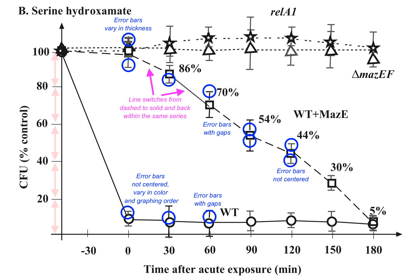
Figure 40:This figure from Kolodkin-Gal and Engleberg-Kulka 2006 LINK shows a variety of manual handling errors, including points, lines, and error bars. The authors were ‘learning to use new software’ at time of publication. First identified on PubPeer.
Figure 41:Gagliardo et al. 2011 LINK. The error bars, their spacing, slope, and even the X-axis markings are irregular.
These figures may provide data that can be scraped and analyzed separately.
Pursuing internal consistency
Individual scientific papers can be substantial, and have multiple layers of internal analysis. They may also be multi-year endeavors within overlying scientific projects that are bigger still. Thus, across multiple scales, we frequently encounter situations where the same sample, result, or circumstances are described more than once.
As might be expected, two or more records of the same underlying set of facts should be identical to each other. This is the case between papers (where two descriptions of the same sample prepared or analyzed in the same manner should be the same) or within papers (where transforms or calculations of the same data should be internally consistent).
Between papers — combining 2 or more papers
Scientific work frequently describes the same data or participants in multiple papers. When this happens, there should be a perfect congruence between the two different descriptions. Finding papers like this is often challenging, because there is rarely any searchable meta-data that will allow an analyst to identify cross-overs without manually inspecting a lot of papers by the same authors (and the problem of accessing different types of meta-data is getting worse). Locating papers like this may sometimes happen by accident, but usually happens if a researcher’s whole corpus of work is being systematically investigated.
However, using some of the techniques outlined above, having two or more descriptions of the same dataset can often reveal mutually exclusive features.
Das et al. (2005) measured physical and biochemical parameters of n=51 girls in Manchester, UK.
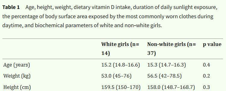
Figure 42:Das et al. (2005), truncated Table 1
This sample of n=51 girls turned up in a later paper by Khadilkar et al. (2007).
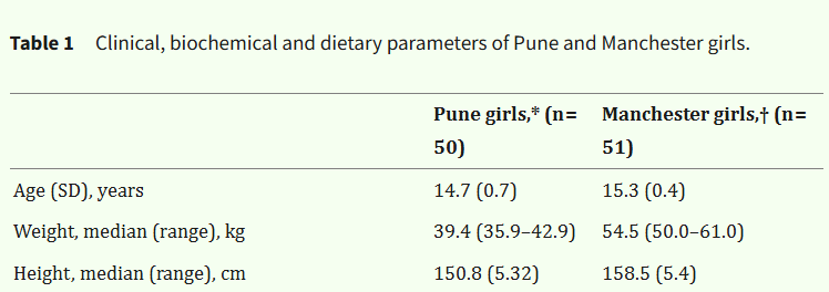
Figure 43:Khadilkar et al. (2007), truncated Table 1
And the n=50 Pune girls were featured in a later paper, Khadilkar et al. (2010).

Figure 44:Khadilkar et al. (2010), truncated Table 1
This example is chosen not because there are large discrepancies, but because this is a good introduction to the complexities involved: in both groups within the central paper, we have two subgroups presented centrally elsewhere. Thus, to fully investigate this, we would need to construct the sub-groups (according to their stated descriptive statistics), and add them together to make the collected samples, and then reproduce the comparisons of those samples. Layers of uncertainty can accrue in any procedure where assumptions are layered, and it is usually irresponsible to conduct an analysis like this in the public domain without consulting the authors and/or raw data.
Within papers — continuous to categorical transforms
Sometimes papers include relevant categorical information which represents an important distinction along a continuum. This happens for body mass in both directions — on one side, obesity (present in categories vs. absent) determined by BMI > 30 when mass/height2 is continuous, on the other, wasting (present in categories vs. absent) determined by weight-for-age Z score.
In either case, an analyst can estimate how likely any given result is. We could use SPRITE to do this, but if we have a strong assumption that the underlying data is normally distributed, we can simply use rnorm in R.
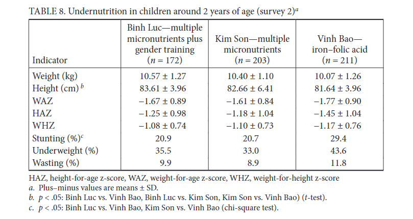
In this paper on undernutrition, all nine of the stated percentage values can be estimated from the z-scores, as height / weight for-age and height-for-weight Z-score cutoffs all determine the status of stunting, underweight, and wasting.
For instance, given the WAZ scores:
- Normal weight: WAZ ≥-2
- Moderate underweight: WAZ ≥-3 to <-2
- Severe underweight: WAZ <-3
Thus, here we might ask: does a normal sample of 172 WAZ scores of -1.67 (SD=0.89) realistically generate 35.5% underweight (i.e. WAZ < -2)? The code block below generates 1000 random samples of n=172, mean=-1.67, SD=0.89 data and measures the proportion below -2, then shows a histogram with the expected result marked.
## R code to place a percentage score on a normal distribution via resampling
## James Heathers, 09/24

paper_value <- 35.5
n <- 172
mean <- -1.67
sd <- 0.89

proportion <- numeric(1000)

for (x in 1:1000) {
  weight_data <- rnorm(n, mean, sd)
  proportion[x] <- sum(weight_data < -2) / n
}

hist(proportion)
abline(v = paper_value/100, col="red")
This produces a graph that should strongly resemble the below:
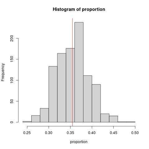
In other words, 35.5% seems to be a perfectly reasonable proportion of the sample to be ‘underweight’. All nine results in this table are similarly non-suspicious, every single one is exactly where it should be. In situations like this, we can confer more trust that the data and calculations performed to it are consistent.
Clinical trial registration
A whole guide could be written on spotting anomalies in clinical trial registration alone. Until someone writes it, the following summary will have to suffice.
Medical trials are expensive and important. As a consequence, over the last 25 years, legislation has been passed all over the world which requires the details of their conduct to be registered in advance. The US repository for clinical trial registration, clinicaltrials.gov, went live in 2000. Originally, registration was only required for clinical trials into novel drugs, but in 2005 the ICMJE (International Committee of Medical Journal Editors) instituted the standard that all clinical trials should be registered before publication. In theory, without a registration, a clinical trial is unpublishable.
The words in theory are present in the above because many trials are published with registration details that are anomalous. It is more important that a registration exists than it be sensible and/or accurate. Peer reviewers frequently do not check trial registrations, even though they are always accessible, and always cited in the relevant papers.
However, this also makes a goldmine for a forensic meta-analyst hunting for anomalies — most registrations contain a large amount of information, presented surprisingly poorly, and never inspected by detail by the journal of publication. There are myriad ways a clinical trial registration may be altered, but there are two primary domains of interest:
Strange timelines
Some medical journals are sufficiently low-quality that they allow authors to retroactively register a clinical trial. That is, the authors perform the work, then afterwards write a formal registration that outlines what they expect to find.
If this seems nonsensical, that is because it is. Any trial that is registered after it is concluded should be regarded as tremendously suspicious, because forgetting to register a trial is simply not something that responsible researchers do.
Dishonest researchers play all sorts of games with clinical trial registration, but the most obvious one is: modifying the timeline presented to a sufficient degree that the paper as it is presented is impossible. This is possible
Previously (in the Simple Numerical Errors section), we met Alafy et al. (2019). Here is a summary of their trial registration, initially presented here:
(1) in November, 2017 the study is registered. It started in June, 2017. It will finish by December, 2017. n=220.
(2) a 2018 update. The study started in June, 2017. It will finish by October, 2018. n=220.
(3) a 2019 update. The study started in June, 2017. It finished collecting primary outcome data collection in August, 2018. It finished all data collection in October, 2018. n=220
(4) a 2022 update. The study started in June, 2017. It finished primary and full study data collection by November, 2017. n=400.
And when this was described in the paper, it described the collection of all n=400 participants between June and December, 2017.
There is no way to make sense of this, as it is not possible. According to this registration, the study started, extended its finishing date, finished, then travelled back in time and finished sooner, with more people recruited.
Modifying outcomes
Modifying the status of a clinical trial’s outcomes is so unfortunately common a problem that it has its own Wikipedia page.
Outcome switching is the practice of changing the primary or secondary outcomes of a clinical trial after its initiation. An outcome is the goal of the clinical trial, such as survival after five years for cancer treatment. Outcome switching can lead to bias and undermine the reliability of the trial, for instance when outcomes are switched after researchers already have access to trial data. That way, researchers can cherry pick an outcome which is statistically significant.
In short, a clinical trial does not measure one single outcome (say, survival over two years following treatment). It measures one or more primary outcomes (the most important measurements) and a (usually longer) series of secondary outcomes.
Classic outcome switching involves (1) taking one of the secondary outcomes, (2) promoting this secondary outcome to a primary outcome, and then (3) writing a paper as if this was always the case. This may happen multiple times with multiple secondary outcomes. There are variations on this theme: a pair of mutually contradictory secondary outcomes may both be promoted, primary outcomes may be forgotten, outcomes that were not even registered as secondary outcomes may be reported as primary, etc.
Outcome switching has been extensively studied. From Goldacre et al. (2019):
Sixty-seven trials were assessed in total. Outcome reporting was poor overall and there was wide variation between journals on pre-specified primary outcomes (mean 76% correctly reported, journal range 25–96%), secondary outcomes (mean 55%, range 31–72%), and number of undeclared additional outcomes per trial (mean 5.4, range 2.9–8.3). Fifty-eight trials had discrepancies requiring a correction letter (87%, journal range 67–100%). Twenty-three letters were published (40%) with extensive variation between journals (range 0–100%).
This really is a sad state of affairs, as the paper above studied trial registrations from ‘good’ medical journals, and found that 7 out of every 8 papers had a registration discrepancy! Every analyst who works in or around medical research will have had experienced a registration discrepancy.
This is not the only way registrations can be misrepresented. In the journey from the registration to the paper itself, we have also seen:
- researchers changing analysis methods
- researchers changing diagnostic cut-offs for tests
- researchers quietly changing the definition of what was collected
If these anomalies are so common, how should an analyst treat them? Many of the other anomalies we have identified are instantly disqualifying to a paper’s accuracy — is this one different?
The answer is: maybe. There are situations where outcome switching represents a straightforward falsehood. In others, they may be more complex, for instance, when a secondary outcome is not directly described as a primary outcome. Instead, it may be implied. The altered registration described in a paper may also perform a reasonable and accurate analysis, even though the manner in which it is presented is less than fully honest.
However, regardless of any qualification, the most relevant rule for analysts is the simple and enduring observation: trial registration must be congruent with the paper itself. This is an underappreciated yet often crucial form of internal consistency.
Meta-analysis and Forensic Metascience
Whole books and journals are available elsewhere for understanding and performing traditional meta-analyses. Many of them decry how meta-analysis is also frequently performed poorly, and the procedural and statistical mechanics of that sorry state of affairs are often remarked on. You do not need to understand meta-analysis well to be a good forensic meta-analyst, although it will be hugely useful.
If you already are a competent meta-analyst, there is only one point worth strongly making here: learning to combine forensic meta-analysis with robustness checks or cross-validation is powerful. When individual studies that strongly affect meta-outcomes are located, having the ability to assess those studies for their internal consistency — and not simply evaluate their risk of bias — will be enormously beneficial to the accuracy of your intended omnibus result. In other words, read everything else here and apply what you learn to your most unusual studies!
(If that is an unrealistic request, you can potentially find a forensic meta-analysts to work with — many studies that are flagged come from meta-analysts who have read their studies carefully, or who have unusual LpOCV results that warrant further investigation.)
More Techniques And Observations
This final section is for less analytical and more haphazard observations than the above sections permit. It is not in any particular order, and is likely to grow substantially in length when future revisions of this textbook are prepared.
Data
We should start this section by getting the elephant in the room out of the way first: and the elephant is data.
Forensic metascience generally investigates in the absence of underlying raw data, but anything we find will be closely related to the quality of that data, because we are analyzing the artifacts or consequences of it.
As might be expected, one of the primary reasons that we would trouble ourselves with all of the above is in the service of getting access to the underlying data — in many contexts, it matters exactly why and how something went wrong. Investigating features of a raw dataset can tell us a great deal more about a researcher’s intentions, and the questions raised from computational reproducibility can usually prompt authors, research institutions, or publishers in a way forensic analysis of papers cannot.
But this is not monolithic. Many forensic metascientific tests are informative by themselves, as they reveal that features of any given paper cannot be accurately described, and therefore that underlying data cannot exist as described. This is enough information to make decisions about trustworthiness, if not exactly why trustworthiness was altered.
Data analysis techniques may either be their own separate book in future, or may occupy a large section of a future edition here.
Context
I have been asked to work on papers in public health, epidemiology, the life sciences, geosciences, social sciences, an array of medical specialties, and many more. I do not understand them all on a granular level. No-one does! This is normal for a forensic analyst, who commonly encounters any given paper as data without a context — dealing with the how of research, and not the why of research. Happily, with the right skills, this is not a barrier to performing a defensible analysis of any given paper. Sociologists do not have their own t-tests, radiologists do not have their own regressions.
However, if you do have domain-specific expertise, you will quickly find tremendous dividends from ingesting the knowledge within this book. It will provide powerful additional tools to your existing insight, and any analyst will tell you that domain expertise and forensic techniques are more powerful together than apart. (They will also typically have some good stories about how an expert in a field flagged a paper for them on the basis of an inconsistency they would never have noticed.)
An example: I was talking once with Professor Ben Mol, who is both an experienced ob/gyn researcher and increasingly involved in forensic metascience research humself, and asked him if he knew of any examples of papers within the literature that were contaminating other meta-analyses. He rattled off a few, but the last paper he mentioned caught my attention, because he threw in the fascinating line:
“5 hours PPROM to delivery is obviously not possible from a clinical point of view”
I had no idea what this meant. I didn’t even know what PPROM was! After a lot of aggressive Googling, I had to piece the following together for myself:
- During pregnancy, the amniotic sac (where the fetus lives, also colloquially known as the ‘water’) can break prematurely. Any rupture that is 3 weeks or more early (i.e. before 37 weeks gestation) is premature, and thus PPROM is Preterm Premature Rupture Of Membranes.
- As proceeding straight to delivery would mean the baby is born prematurely, in many cases you really don’t want that, depending primarily on just how premature it’s going to be. Sometimes, birth is delayed (although it cannot be delayed long). However, there are also risks to the mother in having a ruptured membrane but not giving birth. In this case, you need time to discuss treatment options, sometimes get some additional consultations, sometimes stabilize the mother, organize resources at the hospital, etc.
- Also, PPROM doesn’t always happen in a hospital… so in most cases, (a) the water breaks, (b) the woman has to go to hospital, (c) a decision needs to be made about managing the now-impending premature birth, and (d) there may or may not be a delivery fairly soon after that.
That can’t happen in an average of 5 hours. Maybe 25 hours, but not 5.
That’s the role of expertise in a nutshell. Anyone capable of instantly spotting details like this will have a dramatically expanded toolkit of where to deploy flags and what to trust.
And: as might be expected, a team consisting of (a) a dedicated research domain expert with some forensic meta familiarity, and (b) an analyst with good skills and some domain familiarity will be very well placed to make good trustworthiness decisions.
Combining forensic metascience with forensic scientometrics
There is a whole growing tradition of forensic scientometrics which can inform forensic metascience. Rather than studying data features within papers, scientometrics is more likely to analyze authors, language, citations, journals, publishers, and their mutual interlinkage (amongst other things).
Both fields will increasingly come to inform each other, and tremendous progress is possible. Imagine, for instance, a tool that used automated forensic scientometric techniques to first identified suspicious papers due to a combination of the author, publisher, conditions of publication, etc. and then deployed automated forensic metascientific tools on the data in those papers. Tools like this have the potential to change global publishing.
Big round sample sizes
This is not a technique, but more a reliable observation made over months and years by multiple analysts: a lot of fabricated papers have sample sizes that are weirdly round — n=100, n=300, n=400, or similar.
That’s it, that’s the whole secret. I treat big round sample sizes as a flag, and so do many other analysts.
Crazy contexts and impossible procedures
Papers which sound implausible often are. Did the researchers perform a test that was impossible, or complete a study in a dramatically rapid period of time? That’s a flag. Did they have access to data that is incredibly difficult to find? That’s a flag. Did two researchers perform an entire randomized controlled trial by themselves with n=300 participants over a year? That’s … several flags.
While the above is not an analytical procedure, you instincts in this area will often determine if analytical procedures might be necessary!
A famous recent example was the Surgisphere papers, which were fabricated papers on the use of hydroxychloroquine as a COVID treatment. One of these papers, published in The Lancet, claimed to have analyzed nearly 100,000 patients accessed from a database of ~1200 hospitals.
Only: they didn’t.
The skepticism started immediately when the trial reported to include hundreds of Australian COVID patients, and 73 deaths. It was immediately noticed that during the period the trial data was available before publication, there weren’t that many COVID deaths in Australia.
When that happened, someone from The Guardian simply called a bunch of state health officials and large hospitals in Australia, all of whom confirmed they didn’t participate in the study.
Oops. Obviously, we didn’t need forensic metascience for that one!
But there are a hundred stories which start like this — with someone noticing an implausible procedure or a weird detail — and end in analysis. Many of these papers are a bit funny (like recruiting, breathalyzing, and then testing hundreds of drunks in the middle of the night outside pubs), others are unsettling (like randomizing women with emergency caesarian sections to different suture methods), but all flag papers for further analysis. The regular, non-statistical assessment of research plausibility often has a bidirectional relationship with forensic metascientific assessment.
Uninformative statistics
This isn’t really a test, but it definitely is worth noting: any statistical comparison that seems pointless or redundant will stand out to an experienced analyst.
Imagine you are reading some comparisons in a classical Table 1 format (see ‘Tests for p-values’ for other analytical approaches to this), when you see the below.

Figure 47:From Table 1, in Cheng et al. (2009)
Now, at first glance, this should stand out as unusual. Three identical values, when compared using any regular NHST statistical method, should have a p-value of 1. What’s going on?
Surprisingly, the answer is: this is not necessarily an error. Recall the previous section on the RIVETS test, and what it says about rounded data: the rounded numbers you see may be hiding redacted decimals which can materially change the stated outcomes.
If we test the above using a simple one-way ANOVA, we do not get p=0.687. There is no between-group variance! We get, rather obviously, p=1. But, as per the RIVETS test, if we realise that every sample descriptive value in this table can vary by -0.005 to 0.005 from the stated figure (i.e. 1.604999… is reported as ‘1.60’, and so is 1.595), different p-values emerge as possible.
Maximizing the difference between the groups, and hence lowering the p-value, is served by making the means as far apart as possible and the SDs as narrow as possible. We only need to test one case, where we maximise the first value and minimize the final two (1.605 (0.075) vs. 1.595 (0.065) vs. 1.595 (0.035)) to find a p-value dramatically lower than both 1 and 0.687 — p=0.07! If we apply the same procedure to the last value, we get p=0.05. Very roughly speaking, the difference between these numbers lies somewhere from ‘completely identical’ to ‘statistically dissimilar’.
This is a classic example of an uninformative statistic, and while not an error in its own right, in the right context it can be regarded as a flag. Moreover, this is an example of where the units chosen for reporting and the statistical standards of the journal interact with the ability of an analyst to work. Over time, you will encounter many figures like this. On a journal policy level, it would be entirely more meaningful to report height in finer grained units — perhaps centimeters to 1dp, not meters to 2dp. However, making such a point to the journal is rarely appreciated by a busy editorial board.
Other tests
This book contains only a subset of all the statistical observations used in forensic metaanalysis, it is not comprehensive. The rules for inclusion were simple:
- if I had direct evidence that a test had been used more than once to publicly criticize a paper, it was included.
- if I determined an observation had significant capacity to do so in the future, it was included
This means that there are some very interesting observations that have been made, and sometimes used to successfully critique important or famous papers e.g. Simonsohn (2012), that are not included here.
The promise of AI
No public discussion of forensic metascience is complete without considering the future role of Artificial Intelligence.
If you have read this text linearly, I’m sure it is now quite clear that the statistical / mathematical basis of forensic metascience is simple, and that the complications arise in the understanding and responsible deployment of the simple tools.
This dynamic is precisely mirrored in finding an AI approach that works to assist the central task of forensic metascience — the easy bit will be easy, and the hard bit will be hard.
When asked if whether or not AI will eventually replace the computational tools we developed together, Nick Brown has given the same answer for many years:
“… A lot of people who have seen GRIM have said “Someone should get AI to do that” and my reply has always been “What a great idea, let me know when you’ve got it to work”.”
I find myself in exactly the same position as Nick — skeptical but hopeful. The easy bit is the calculations themselves, and the approach to how to deploy them. Some of the analyses here could quite conceivably be reproduced by Claude, or GPT4. But the hard part, and the hard part is very hard, is parsing the original text in order that an LLM might understand which calculations to deploy.
An example: in many analyses, only by piecing details from several different pages in the same manuscript can you be certain that the same (simple) analysis is being deployed properly. Say a group of authors report:
(1) the outcome of a scale (a whole number) in the results, but
(2) earlier in the method section is the only time they mention that there are subscales within that scale, and
(3) only by following a citation given at the end of the introduction will you discover than only a subset of those subscales are used to form the score reported in (1), and the authors think that ‘everyone knows that’ because it’s how the score is always reported in this particular subfield
There are a thousand variations of this level of complication which add to the sometimes-insurmountable fact that in their fundamental conception, scientific papers were never designed to be machine-readable.
I sincerely hope that future editions of this text will outline some progress that has been made in formalizing open source tools for computational forensic metascience. However, if progress does come in this area, I think it is very likely to be incremental. There is a low likelihood of anyone developing a system where we simply feed the paper into an AI system to have every conceivable form of accuracy checked for us reliably. At an absolute minimum, many years of progress are required before this could happen reliably enough to reduce analysis time.
In other words, AI solutions are likely to be more effective for ‘many-to-one’ problems — how to mass-screen a large amount of documents to proactively detect problems for research — than for ‘one-to-one’ problems, where a single manuscript or text of interest generates a single report on its accuracy. Given that, it is likely that the intermediate versions of AI-powered forensic tools are worth pursuing. Two domains are suggested:
(a) finding simple ways to reliably flag documents for later analysis, by choosing flags which are analytically straightforward, or
(b) finding ways to combine well-structured information (probably the scientometric details of any given article — the journal of publication, authors, time taken to review, etc. — which are much more accessible and far better structured than the information in the article!) to produce flags which are not from the data features of the paper.
Either of these could conceivably reduce a pile of papers too large to analyze (say, 10000 papers) into a much smaller pile (say, 200 papers) where your hit rate for deploying analysis successfully to locate anomalies will be higher. Research integrity researchers and publishers will find these tools more readily useful and available than Research Integrity Officers.
Other approaches are possible, and difficult to predict. It will be interesting to see what they are, and their progress over the next two to five years.
Releasing findings, and academic journals / editors
This section could be a lot longer, but has been essentialized.
In some contexts, a forensic metascientist is working for another party, and very likely subject to an employment agreement. Generally, this will not involve releasing findings publicly, because whatever is found will have some kind of local value (monetary or otherwise).
More typically, analysis is performed in the public interest, so any anomalies that are found should naturally be in the public domain. But also, if the criticism made is of a paper in an academic journal, academic norms would (debatably) dictate that the anomalies should go first to the editorial and/or research integrity staff responsible for the journal in question.
This can be frustrating. Many, even most, journals do not respond to criticism well, in that they frequently do not respond at all. Every single forensic metascientist has had the following experience:
- Has found anomalies in published literature
- Sent a record of those anomalies to the journal staff responsible for the accuracy of publication
- Wait
- See 3.
Journals are notorious for ignoring, slow-walking, or even being actively hostile to criticism. They can take years to act, and if prodded into action, produce consequences that are limited, obfuscatory, or dismissive. As a consequence, forensic metascientists working in the public interest or out of curiosity usually disclose their findings in the public domain, and let transparency sort it out.
This is exactly the same as the very long established principle of full disclosure within computer security:
Full disclosure – the practice of making the details of security vulnerabilities public – is a damned good idea. Public scrutiny is the only reliable way to improve security, while secrecy only makes us less secure.
The parallel should be obvious.
But there are additional concerns here, and there are situations where involving authors, universities, and journals instead of publicly releasing findings is the prudent or correct thing to do.
These include, at a minimum, when:
- there are potential legal problems from criticism (it is some protection from prosecution — and in some global jurisdictions, absolute protection — to publish criticism as peer-reviewed commentary)
- there are anomalies that can only be investigated or resolved through access to data
- problems are sufficiently serious that it is likely all parties will eventually be involved anyway
- authors or journals in particular are judged more likely to act in good faith
- you are working on a project that requires contact with one or more parties for data collection
- you judge it ethically appropriate given the nature of the uncovered inconsistencies
Repeating Analysis and Load-Sharing
Some analyses produce important, even newsworthy findings. It is particularly important that these are performed and disseminated responsibly. Assuming this responsibility typically means that analysts work in teams, or that after an analysis is produced, it is reviewed by a second analyst (a kind of ‘home brew’ peer review).
There are typically three approximate levels to this, with escalating seriousness.
- Editing and sanity-checking
- Requests for specific reproduction
- Blind re-analysis
Sanity-checking is turning a completed analysis over, usually with notes, annotation, and code to another analyst for a direct analogue of peer review — checking over a completed document for mistakes.
Specific reproduction involves asking a second analyst to check a result or finding in isolation. In trickier cases, there may be a few of these. Typically, an email is sent (‘can you use technique X to check the information in the last paragraph of the results on page 7, and tell me what you find?’) This is quite efficient.
Blind re-analysis is for the most serious of cases, where any the release of an analysis might involve lost jobs, recrimination, legal threats, money being returned to funders etc. In this case, you ask another analyst — very nicely, because you are asking for a lot! — to redo an analysis from scratch, and blinded. No clues, and no hints. On that basis, if the original forensic results can be recreated in part or in whole, it is a much stronger signal that the inconsistencies found are in fact genuine.
To my knowledge, no forensic meta-analyst has ever released a major finding to the public which was unfair, incorrect, or problematic. At least, for a given value of major. And we would like to keep it that way.
There is one powerful factor that maintains this perfect record beyond the responsibility and diligence of analysts: the fact that putting a critical analysis in the public domain with your own name on it means you are strongly incentivized to be completely fair and correct. While we wish to be recognized for our work, we also very strongly wish to not be recognized as doing it badly, considering the stakes that can be involved.
Acknowledgments
Acknowledgements
I would like to acknowledge both the original funders for the development of this text, the Bill and Melinda Gates Foundation, and in particular the support of DAC and Shawn Dolley.
I would also like to recognise the efforts of the entire forensic metascientific community, whose work I have tried to do justice to in the text above.
- Heathers, J. (2025). An Introduction to Forensic Metascience. www.forensicmetascience.com. 10.5281/ZENODO.14871843
- Alalfy, M., Elgazzar, A., Fares, T., Nagy, O., Ellithy, A., Lasheen, Y., Kamel, A., Soliman, M., Hassan, A., Samy, A., Taher, A. M., Ogila, A. I., Saad, H., Salah, H., Ramadan, M., Nabil, M., Hatem, D. L., & Fikry, M. (2018). Effect of subcutaneous tissue closure technique in cesarean section on postoperative wound complications in obese Egyptian women. The Journal of Maternal-Fetal & Neonatal Medicine, 32(15), 2452–2459. 10.1080/14767058.2018.1438399
- Olsen, C. H. (2003). Review of the Use of Statistics in Infection andImmunity. Infection and Immunity, 71(12), 6689–6692. 10.1128/iai.71.12.6689-6692.2003
- Heydendael, V. M. R., Spuls, P. I., Opmeer, B. C., de Borgie, C. A. J. M., Reitsma, J. B., Goldschmidt, W. F. M., Bossuyt, P. M. M., Bos, J. D., & de Rie, M. A. (2003). Methotrexate versus Cyclosporine in Moderate-to-Severe Chronic Plaque Psoriasis. New England Journal of Medicine, 349(7), 658–665. 10.1056/nejmoa021359
- Bauer, P. J., & Francis, G. (2021). Expression of Concern: Is It Light or Dark? Recalling Moral Behavior Changes Perception of Brightness. Psychological Science, 32(12), 2042–2043. 10.1177/09567976211058727